
 USD
USD
Best Fonts for Embroidery on Apparel and Hats: Technical Guide

Introduction
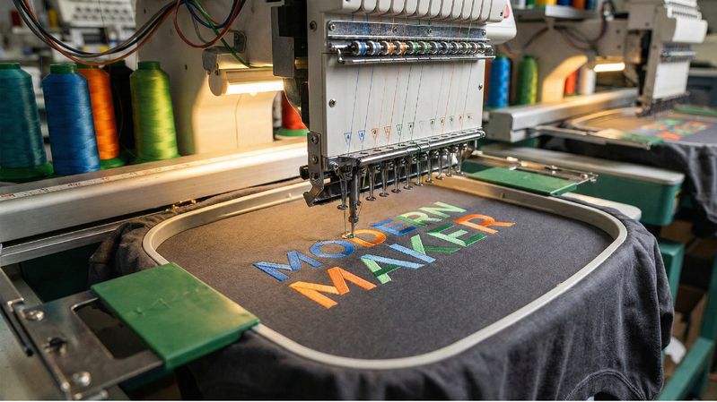
Embroidery continues to rise as one of the most premium and profitable decoration methods in apparel. From minimalist chest logos to vintage varsity lettering, embroidery gives clothing a high-quality, elevated feel that printed designs can’t always replicate. As more brands, creators, and POD apparel sellers turn toward upscale garments like heavy hoodies, structured T-shirts, long sleeves, hats, and sweatshirts, clean, legible embroidery has become a top priority.
But embroidery behaves very differently from printing. Ink can follow razor-thin lines and micro-details — thread cannot. The font you choose directly affects stitch clarity, legibility, durability, and overall perceived quality. Pick the wrong font and your letters may close up, distort, fray, bend, or become unreadable after a few washes.
This guide breaks down the best font types for embroidery, the technical rules you must follow, the worst fonts to avoid, ideal stitch sizes, and how PODpartner supports embroidery-ready typography with over 100 curated fonts designed specifically for stitching.
Whether you’re creating a premium streetwear line, minimalist lifestyle merch, branded uniforms, or embroidered hat drops — this article gives you the exact criteria needed to choose perfect embroidery fonts every time.
Why Font Choice Matters in Embroidery
Embroidery isn’t just "printing with thread." It has unique physical limitations:
Thread behaves differently than ink
Ink sits flat; thread stacks, overlaps, and creates dimension. This means font shapes must be thick enough to remain stable.
Small text can distort
At tiny sizes, thread fills gaps uncontrollably, closing counters (the hole inside letters like a, e, o, p).
Thin strokes may disappear
Fonts with hairline strokes, thin serifs, or delicate scripts often cannot maintain shape.
Fabric texture impacts clarity
Ribbed hoodies, fleece sweatshirts, and textured cotton can distort thin details.
Stitch direction alters the appearance
Stitches follow horizontal or angled directions, which affects how curves and diagonals look after stitching.
This is why choosing embroidery-safe fonts isn’t purely aesthetic — it’s technical. Selecting fonts specifically designed (or adapted) for embroidery results in clean, professional, premium-looking apparel.
Technical Criteria for Choosing Embroidery Fonts
If you want perfect stitching every time, evaluate fonts using these rules:
1. Minimum Stroke Thickness
Letter strokes must be thick enough for satin stitching.
Thin strokes break, fray, or disappear.
2. Minimum Letter Height
Too-small fonts close up, especially lowercase letters.
You need reliable minimums (covered later in the size chart).
3. Avoid Fine Serifs
Thin serif details mis-stitch easily.
Use slab serifs or thick, stable ones instead.
4. Proper Spacing & Kerning
Thread expands slightly during stitching, so fonts need:
- extra spacing
- generous kerning
- open counters
Dense fonts will merge or distort.
5. Thread Pull & Push
Thread tension pushes stitches outward horizontally. Vertical stitches pull inward.
Fonts must be structurally balanced to compensate.
6. Satin Stitch Compatibility
The best embroidery uses satin stitches — only thick fonts can support them.
When in doubt, thicker is always better.
Best Font Categories for Embroidery
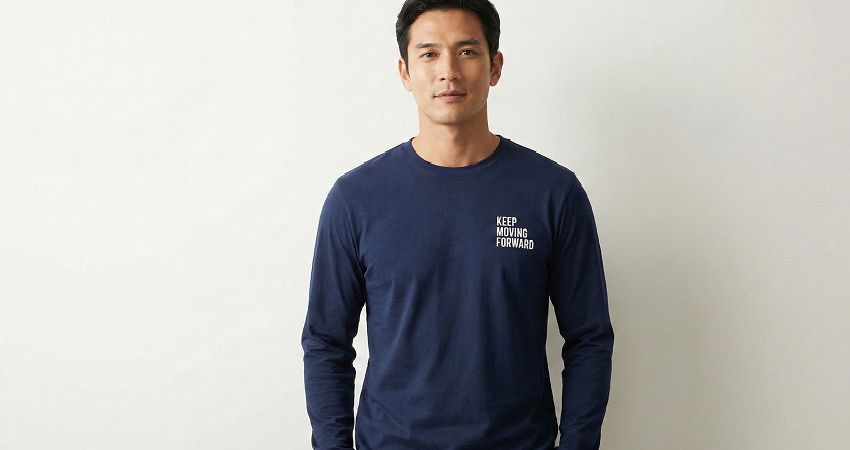
Below are the styles that consistently stitch cleanly on apparel, hats, sweatshirts, and hoodies.
Block / Sans-Serif Fonts
- Simple, geometric
- No serifs
- Excellent readability
- Works for logos, athletic wear, corporate branding
These are the most dependable embroidery fonts.
Rounded Sans-Serif Fonts
- Smooth corners reduce snagging
- Great for lifestyle, casual, and youth apparel
- Easier for embroidery machines to follow
Rounded fonts also feel more friendly and modern.
Slab Serif Fonts
- Thick, stable serifs
- Great for vintage, western, collegiate looks
- Holds shape even with dense stitching
Slab serifs stitch better than thin serif typefaces.
Script Fonts (With Limitations)
- Must be thick, connected, stable
- Best for boutique apparel, feminine scripts
- Avoid thin, calligraphy-like hairlines
Use only scripts specifically labeled embroidery-safe.
Vintage & Retro Lettering
- Chunky lettering
- Thick outlines
- Perfect for heavy stitching
- Popular for 90s streetwear and college-inspired apparel.
These maintain shape extremely well under satin stitching.
PODpartner’s Embroidery Font Advantage
Unlike traditional POD platforms, PODpartner’s Design Creator includes over 100 embroidery-ready fonts, each hand-tested for:
- clean stitching
- readability at multiple sizes
- smooth satin-stitch compatibility
- thick enough stroke weight
- open counters for clarity
These fonts work across the entire PODpartner apparel catalog, including:
- hoodies
- T-shirts
- long sleeves
- sweatshirts
- tank tops
- pants
- shorts
For embroidery-heavy brands, this built-in library offers tremendous value — especially since most POD platforms limit users to only a few embroidery-safe fonts.
Fonts to Avoid in Embroidery
These categories usually produce poor results:
Thin Line Fonts
Hairline strokes disappear completely.
Highly Detailed Handwritten Fonts
Loops collapse, the thread overlaps uncontrollably.
Distressed or Grunge Fonts
Texture cannot be stitched reliably.
Tall Condensed Fonts
Narrow spacing causes merging.
Fonts With Small Ornamental Serifs
Serifs break, warp, or fray.
Avoid these styles unless enlarged significantly and tested thoroughly.
Recommended Minimum Font Sizes for Embroidery
These are essential guidelines for apparel embroidery clarity:
Chest or Front Logo Embroidery
- Minimum height: 0.25 in (6.35 mm)
- Best range: 0.3–0.5 in (7.6–12 mm)
Sleeve Embroidery
- Minimum height: 0.35 in (9 mm)
- More distortion risk because sleeves stretch.
Tag-Style Small Embroidery
- Minimum height: 0.5 in (12.7 mm)
- Best for monograms or tiny logos.
Large Back Embroidery
- Minimum height: 1 in (25.4 mm)
- Ideal for varsity, retro, or block lettering.
When unsure, size up — thread expands, not shrinks.
Best Embroidery Font Use Cases for Apparel
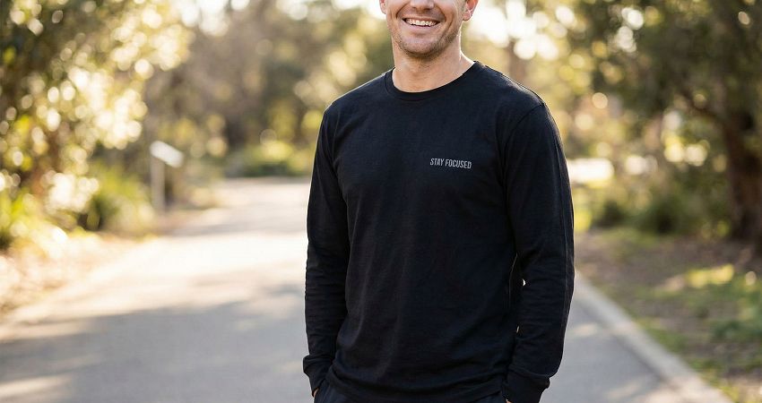
Here’s how different font categories shine in apparel applications:
Minimalist Chest Logo Tees
- Sans-serif
- Rounded sans-serif
- Small monograms
Clean, modern, professional.
Monogram Hoodies
- Slab serif
- Heavy serif monogram fonts
- Engraved-style embroidery
Perfect for elevated boutique branding.
Motivational or Lifestyle Word Embroidery
- Thick script fonts
- Rounded sans-serif
- Retro chunky text
Popular for wellness, fitness, and lifestyle niches.
Sleeve Text on Long Sleeves
- Slab serif
- Sans-serif
- Narrow block type (not condensed)
Great for streetwear vibe.
Small Icon + Text Combos
- Block fonts
- Rounded fonts
- High-contrast satin stitching
Ideal for hats, hoodie pockets, or shorts.
Common Embroidery Font Mistakes to Avoid
Many beginners choose fonts based only on aesthetics. Avoid these pitfalls:
Choosing fonts meant for printing
Just because it looks great on screen doesn’t mean it stitches cleanly.
Ignoring stroke width
Thin strokes break during stitching.
Not testing small text sizes
What looks readable in a mockup may close up in real life.
Poor thread-to-fabric contrast
Light thread on light fabric = unreadable.
Over-stylized typography
Avoid overly decorative, swirly, or distressed type.
Good embroidery values clarity over complexity.
Final Thoughts
Embroidery continues to dominate premium apparel categories, and choosing the right font is one of the most important decisions you’ll make when designing stitched apparel. The best fonts aren’t always the fanciest — they’re the ones that maintain clarity, durability, and visual impact after stitching.
By following the technical guidelines above, selecting thick and stable font categories, avoiding overly detailed typefaces, and understanding minimum sizing rules, you can dramatically improve the quality of your embroidered apparel.
For brands using print-on-demand, PODpartner provides a major advantage with over 100 professionally selected embroidery-ready fonts and industry-leading embroidery support (JPG and DST files, up to 15 thread colors, and apparel designed specifically for stitching stability).
Whether you’re creating streetwear, minimal branding, or retro embroidered apparel, the right font choice ensures your designs look crisp, premium, and ready for market.
Further reading

No Order Minimums

No Membership Fees

No Unsold Stock

No Quality Concerns
Only Creativity, Satisfaction, and Profits!