
 USD
USD
Retro-Futurism Design Elements & Color Palette Guide

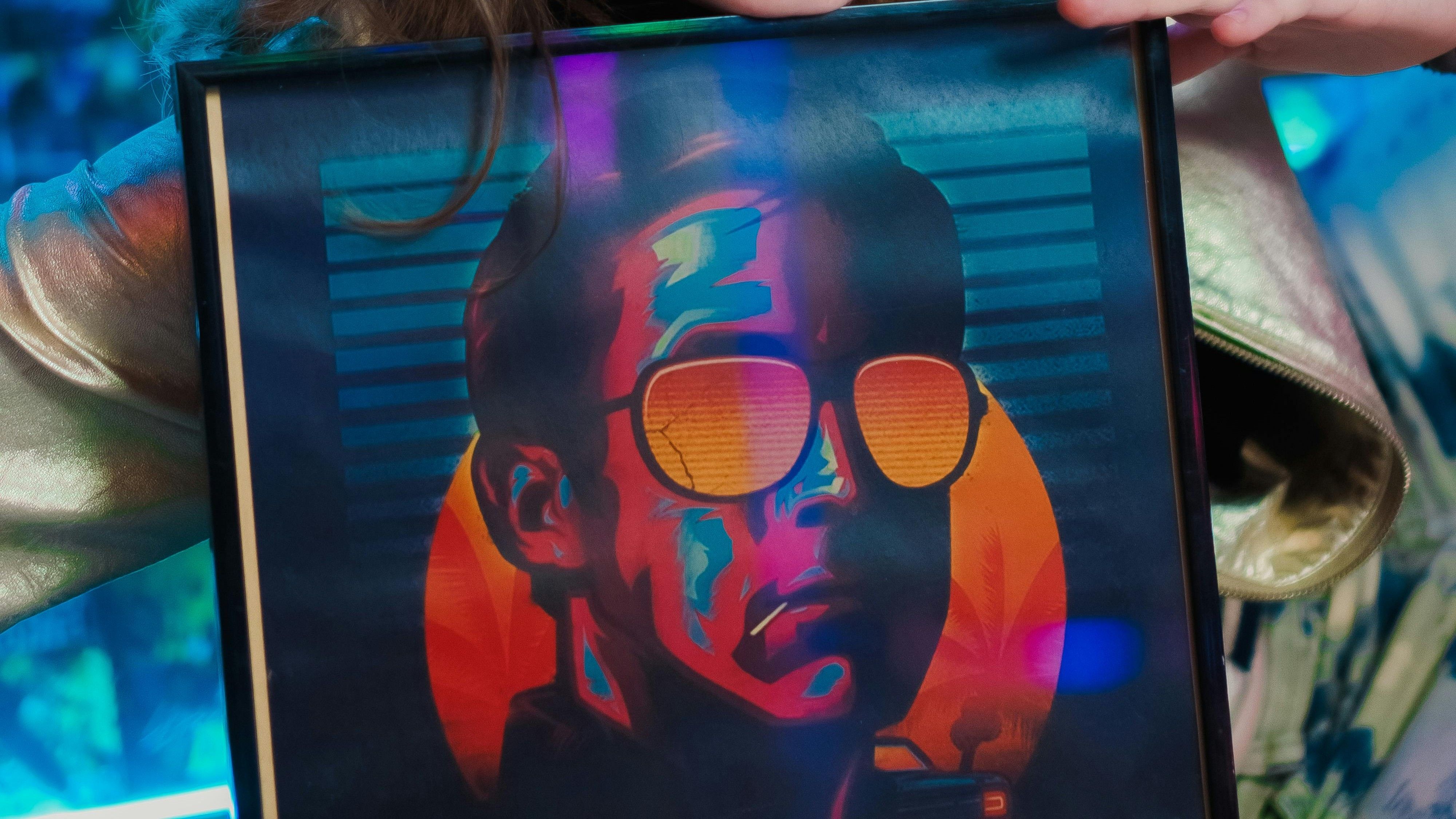
Being able to inspire others with one’s thoughts and imagination especially in an art manner is incredible. Perhaps this is why retro-futurism design concepts are trending in design, fashion and branding.
People tend to be naturally inclined towards ideas and concepts which, though unrealistic, capture their imagination to what if they were real.
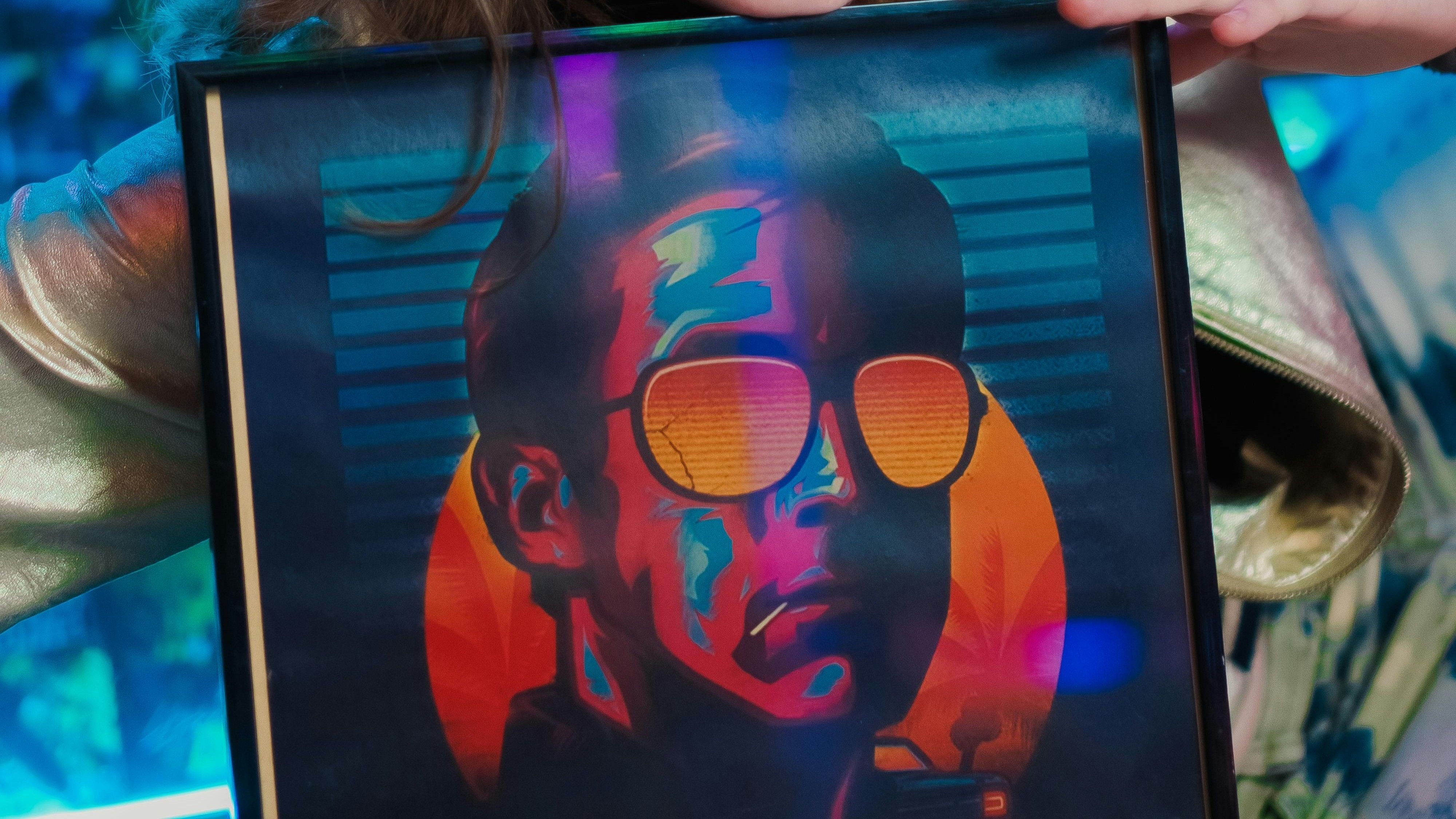
The entire genre of retro-futurism revolves around merging the unhappened past elements with their future forms. In simple words, its about expressing two thought processes distanced by time but bridged in present to form a comforting yet nostalgic perspective of how ideas from past would evolve in future.
For instance, bold and metallic tones combined with surreal patterns showcases a unique fashion perspective of a fast fashion brand.
In this article, we explain what retro futurism design is and discuss elements, palettes, applications, and tools that enable it.
What is Retro-Futurism?
Retro-Futurism is the genre which showcases reflects futuristic reflections of ideas, visions, and imaginations as perceived by a past generation in that point in time but how they would appear in the unhappened future.
In simple words, it’s a bridge which evades the time travelling gap between nostalgia and its futuristic imagined form.
Retro-Futurism History: What inspired it to begin?
Primarily speaking, retro-futurism surged during 1950s and 1980s, an era which not only experienced technological advancements in space travel, but also displayed nostalgic yet highly futuristic visions of how life in space would be via shows like Star Trek, Star Wars, and Back to the Future.
Influence of Retro Futurism Graphic Design Today
While retro-futurism began and mostly revolved around space-age design elements between the 1950s and 1980s, its trend has resurfaced again. Many modern-day designers and visual artists are incorporating retro-futurism space-age designs into graphic, interior, and fashion design.
An aesthetically blended vintage-futurism design concept isn’t just nostalgic for old audiences, but also inspires today’s young audiences to explore newer avenues beyond their imagination.
How Retro-Futurism Differs from Vaporwave and Synthwave Aesthetics?
While today’s audiences might confuse retro-futurism with vaporwave and synthwave aesthetics, here is brief to understand it better.
Retro-Futurism is basically futuristic visions and imaginations as envisioned by a past generation.
On the other hand, Vaporwave, basically reflecting the era between mid-90s and mid-2000s, encompasses a softer, pastel-toned design element.
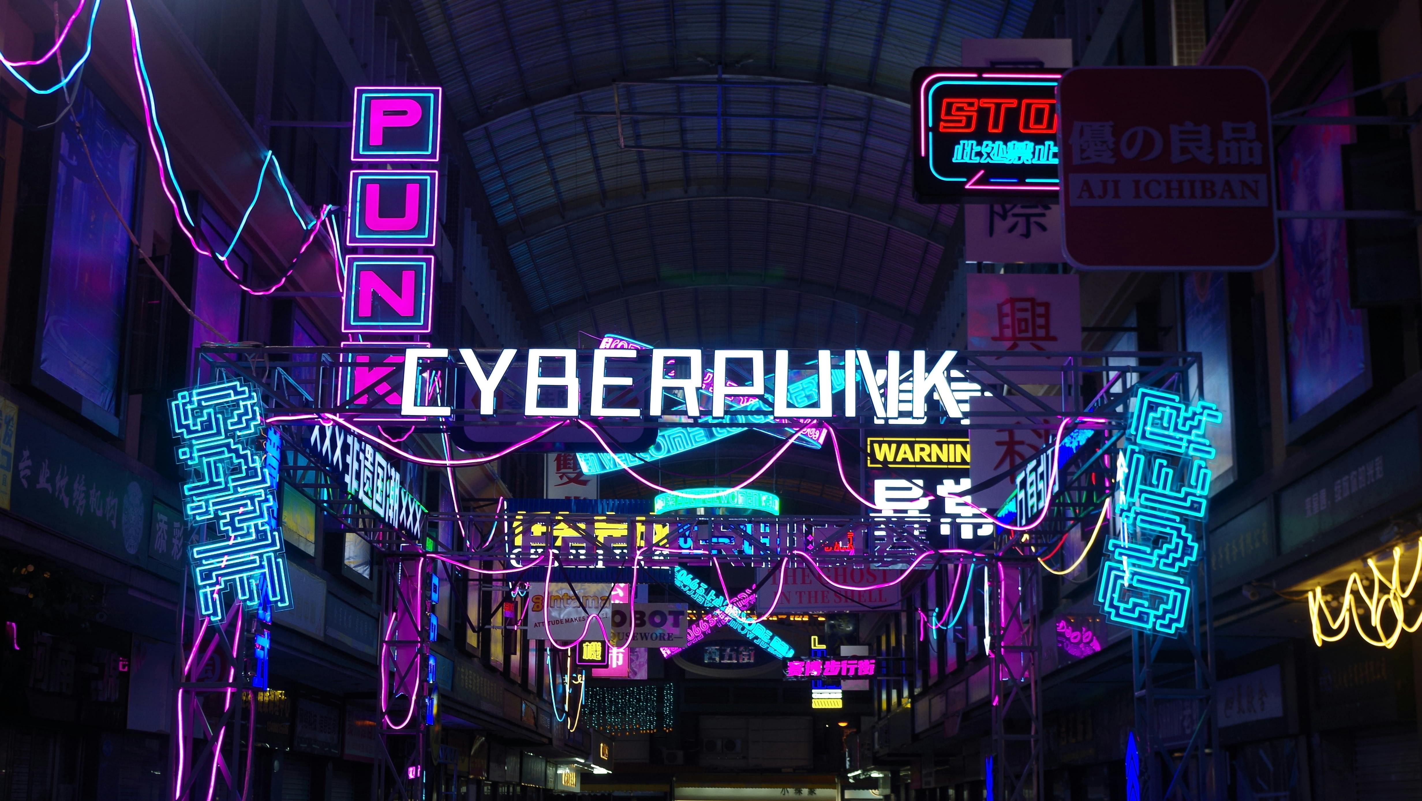
Lastly, Synthwave aesthetics characterizes the mid-80s design elements such as grid patterns and cityscapes with futuristic feel, often directing more towards vibrant neon colors.
Key Design Elements of Retro-Futurism
Like any other design genre, retro-futurism design combines some design elements which make it different from other. Here is a brief overview of the key retro-futuristic aesthetics design elements which gives it its unique perspective.
1. Geometry and Layout
In retro-futuristic aesthetics, grid, retro grids and orbit lines feature an infinite type space with intersecting lines, and computer-generated virtual landscape environments. This not only offers depth, but also combines neon type bright and vibrant colors with fuzzy and distorted longitudinal and latitudinal lines.
2. Typography
Retro-futuristic aesthetics will often display chrome and bold sans-serif styled typography, something that resonates a futuristic theme but stems from past.
3. Textures and Materials
To bring in that futuristic design approach, retro-futuristic design will often blend grainy and faded details with reflective and shiny surfaces such as chrome and metals. To create a sense of noise, retro-futuristic aesthetics may use latex or metallic textiles.
4. Lighting and Effects
To bring in a contrasting feel into its metallic and chrome textures, retro-futurism designs integrates lights and effects with vibrant and contrasting colored neon and glowing lights.
5. Motifs
Just like everything else above, retro-futurism designs incorporate geometric patterns, space science themes which are inspired from space ships and other planets, and reflective metallic surfaces with neon colors. In simple words, anything you see in a science fiction movie featuring space and planetary objects imagined to occur far off in future, is what inspires motifs in retro-futurism aesthetics.
Retro-Futurism Color Palettes
Why color defines retro-futurism: contrasts, duotones, neon?
Just like the key design elements discussed above, retro-futurism color palettes play an important role in defining retro-futurism aesthetics. Without a proper retro-futurism color palette, the journey from a nostalgic past imagining a technologically advanced future in space craft won’t be truly possible.
In simple words, retro-futurism color palettes while showcasing the future advancements, are actually derived from how past generations would have imagined them in their time.
To enable this, retro-futurism design color palettes will often incorporate color choices with contrasts, duotones and neon to create complex yet modern aesthetics.
Retro-Futurism Color Palette Examples and Matching Rules
A balanced color palette is necessary to form an aesthetically pleasing design, preferably one which clearly follows the 60-30-10 rule. Example would be using a neon gradient or pastel neon colors. Here 60% is the dominant color, 30% is the supporting color, and 10% is the accent.
In detail, dominant (60%) is the main color which occupies most of any applied space. Next is supporting (30%) color, also known as secondary, which generally would contrast half of the dominant color. Lastly is the accent (10%) color which although appears to be less than the other two, is highly important. Accent color are usually high contrast to highlight the important key elements of the overall design.
Applying the above rule to retro-futurism color palette usually brings out the following:
1. Neon Night
Often characterized by bold and digital-first elements.
• Black (60%) - #100E2C
• Cyan (30%) - #333D94
• Magenta (10%) - #D41E79
2. Pastel Glow
Brings out a softer and fashion-friendly tone.
• Peach (60%) – #F4F4F4
• Mint (30%) – #00F5D4
• Lavender (10%) – #9B5DE5
3. Metallic Past
Seen as timeless for branding purposes.
• Cream (60%) – #EDE6D6
• Silver (30%) – #B88B5B
• Bronze (10%) – #C0C0C0
5. Applications Across Mediums
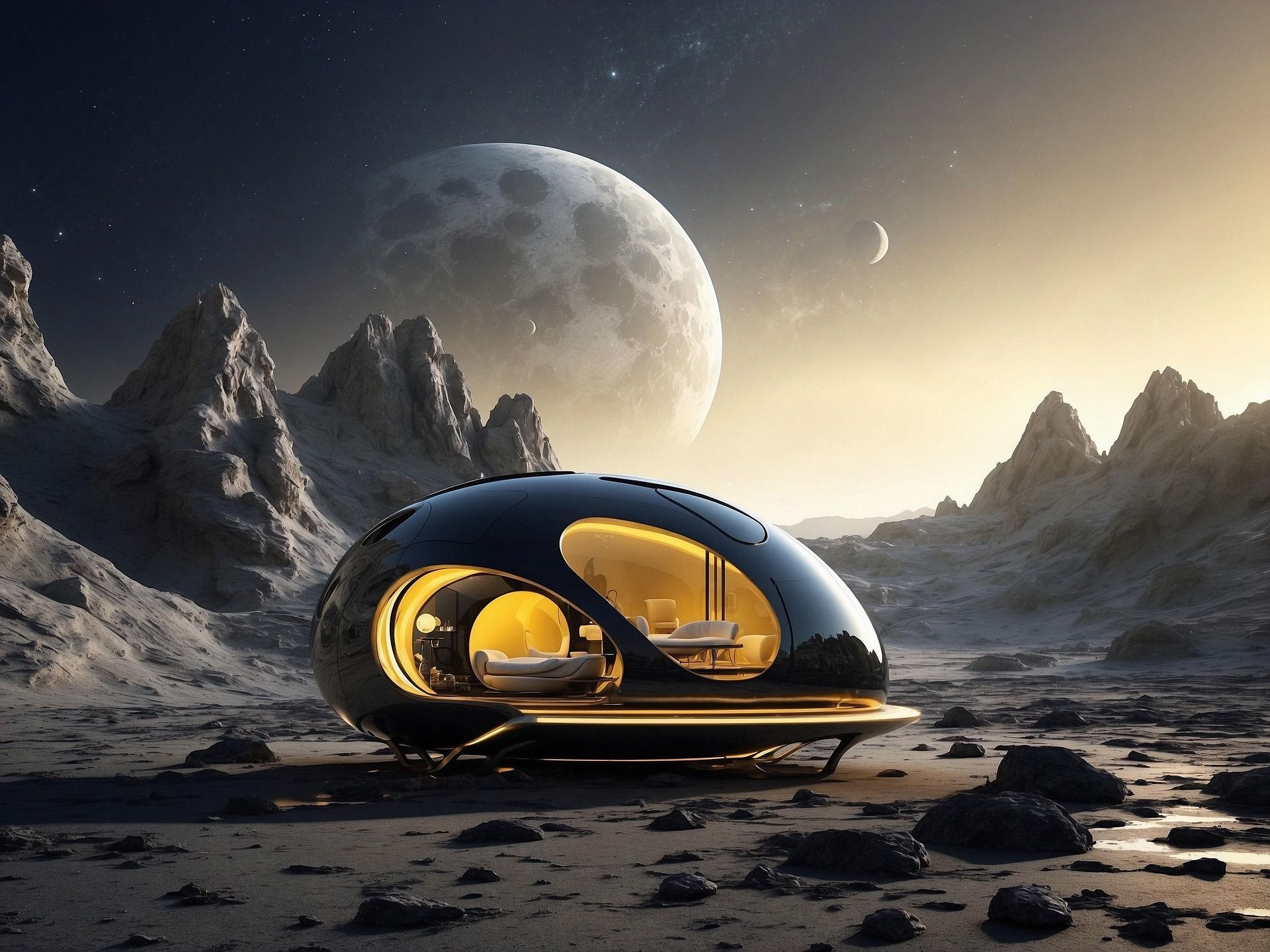
Retro-Futuristic design trends have been popular across all major industries. For instance, modern audiences inspired by space-age shows have a deep following for retro futurism interior design retro-futurism fashion.
But this isn’t limited to this only. You will find retro-futuristic design trends being adopted in branding and packaging industry usually in the form of chrome foil printing and neon color packaging.
Many websites and UIs use retro-futurism color palettes to highlight CTAs and drive audience attention to other important details.
Similarly, fashion and interior design industry offer more designs by creating their own imaginations onto apparels such as tees and hoodies, and interior design products such as furniture and wallpaper.
Perhaps a more realistic approach to testing retro-futuristic design trends is by reaching out to a reliable POD partner. POD partner design tool not only creates realistic renders of such unique designs, but also offer printing test samples in fewer quantities and affordable rates before launching a full line of products.
6. Building Your Own Palette
If you are inclined towards retro futurism art, perhaps it is important to first know how to create a retro-futurism color scheme. Here is a quick step-by-step guide on how to do begin –
Step 1: Define Mood
Defining mood means imagining how you think someone from past would have imagined the future to be. Do you want to create a sense and let the audience analyze your retro futurism art, or do you want to set a complex and critical vision of the future?
This means choosing between neon color palettes and reflective metallic tones or saturated harsh and dark tones.
Step 2: Select 1 Dominant + 1 Supporting + 1 Accent
Next comes the selection rule we discussed in detail above. Choose one dominant (60%) main color, one supporting (30%) secondary color, and one accent (10%) highlighting color.
Step 3: Test Across Mediums
Next you would want to test your retro-futurism color scheme effectiveness across different mediums. This will allow you to better understand your color palette choice for your retro futurism art and how it will perform digitally and printed form.
Step 4: Ensure Accessibility and Color Contrast
A carefully curated retro futurism art color palette will not only offer accessibility, but also effective color contrast to make it create its own impression on the audience.
Conclusion
Retro-futurism design are fast gaining popularity among young audiences as well as older people since it allows imagining nostalgia inspired future technology. Obviously, a thoughtfully curated retro-futuristic color palette is important for this purpose, but so is selecting the right print-on-demand service to test your creativity.
PODpartner is one such print-on-demand service which not only allows you to test your retro-futuristic art, but can also fulfill all your other print-on-demand needs after you successfully launch your design line. Visit PODpartner website now to find out more about how we can help you.
Further reading

No Order Minimums

No Membership Fees

No Unsold Stock

No Quality Concerns
Only Creativity, Satisfaction, and Profits!