
 USD
USD
Heat Transfer Vinyl Shirts: What Each Finish Costs You
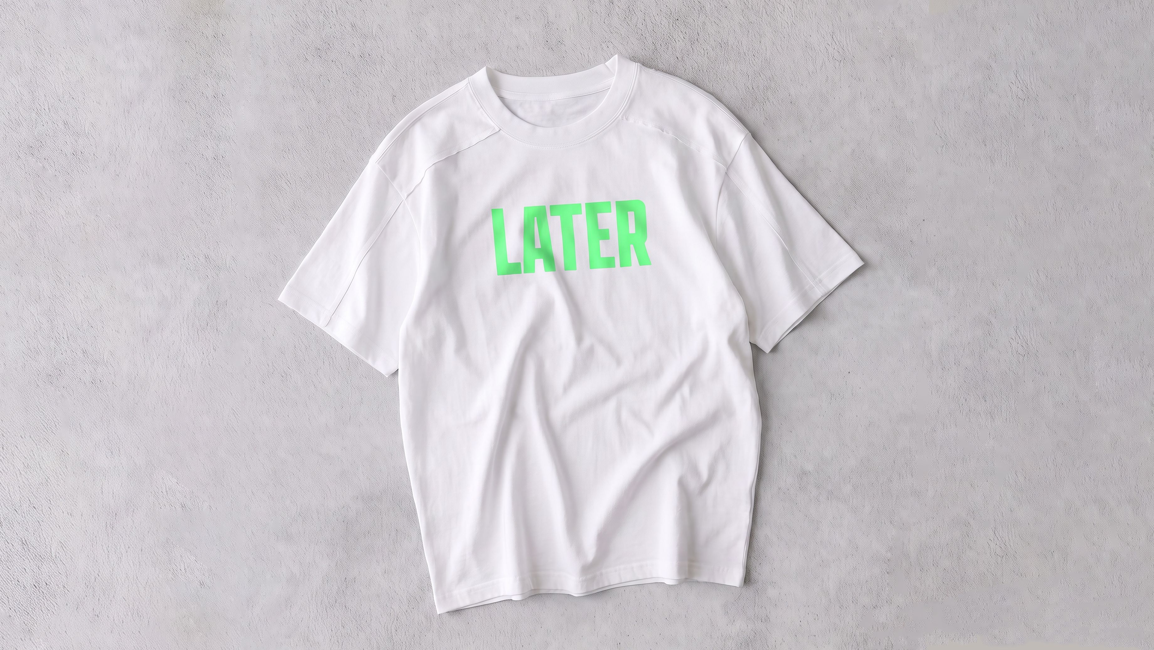
Most guides to heat transfer vinyl tell you what each finish does well. This one covers the other half: what each one gives up, and why.
Every Heat Transfer Vinyl finish is a piece of pre-colored film cut to a shape and pressed onto fabric. The film sits on the surface as its own object with its own optical behavior, which is exactly why it can produce sheen, glow, and texture that ink pushed into fibers cannot. It's also why each finish behaves in ways a design file won't predict.
If you want the material descriptions, thickness specs and pricing, those live in our Heat Transfer Vinyl materials and pricing guide. This piece assumes you've seen the six finishes and are deciding which one to actually put on a product.
1. Why every finish has a catch
The tradeoffs below aren't manufacturing defects. They come from one mechanical fact.
Direct-to-garment printing pushes water-based pigment into cotton fibers. The print takes on some of the fabric's own texture and behaves like part of the shirt. Embroidery builds a raised object out of thread pulled through the weave.
Heat Transfer Vinyl never touches the fiber. A cutter follows the outline of your design, the excess film gets weeded away, and what remains is heat-pressed onto the surface. That film was manufactured with a specific surface finish, the same way a phone case or a car wrap is.
A manufactured surface is what makes chrome sheen and phosphorescent glow possible. It's also what makes those effects depend on viewing angle, ambient light, and distance in ways ink never does. The same property produces both the effect and the catch.
One more mechanic worth stating before the list. The cutter reads shape, not color. Everything inside your design's outline gets replaced by whatever color the film happens to be, so a blue-and-red logo cut from gold glitter comes back as a solid gold glitter shape. That's covered in more depth in the materials guide, but it's worth keeping in mind as you read.
2. Metallic: the sheen depends on where the light is
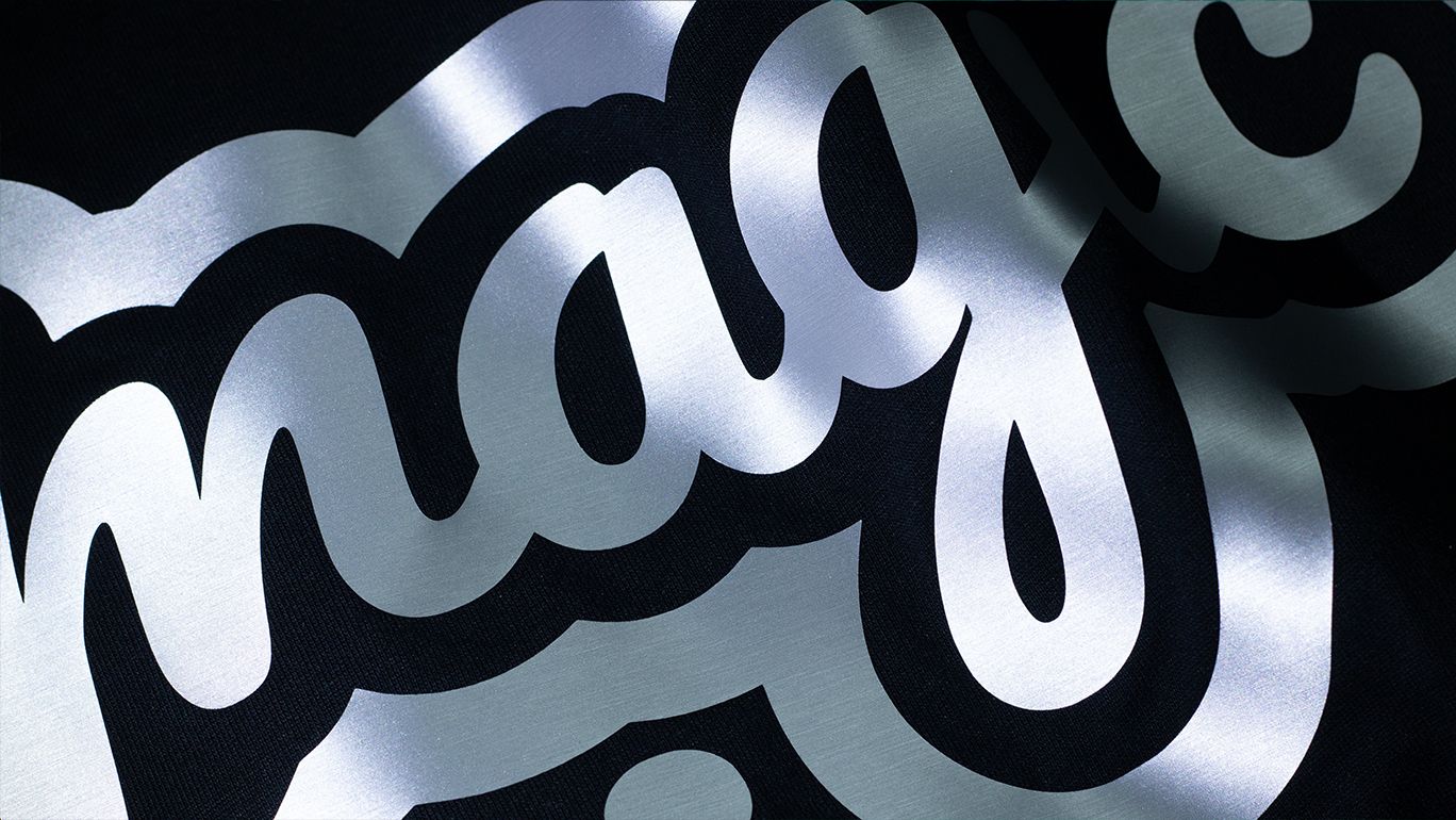
Metallic film reflects light rather than absorbing it, which is what produces the polished-chrome read. The finish is soft and even, closer to a mirror than a disco ball.
What it gives up. Sheen only exists when light hits the surface at an angle and bounces toward the viewer's eye. Put a metallic print directly under an overhead light and the reflection flattens out, sometimes reading closer to plain gray than chrome.
That's a property of anything reflective. A mirror looks dull under a light positioned straight above it for the same reason. It isn't specific to this material and it isn't a fault in the press.
What to do about it. Photograph metallic pieces with a side light source. A product shot taken under flat overhead lighting will undersell the finish badly, and that's the image a shopper decides from. If your storefront photography setup is a ring light directly in front of the garment, metallic is the finish most likely to disappoint in the listing.
3. Glitter: resolution is the price of impact
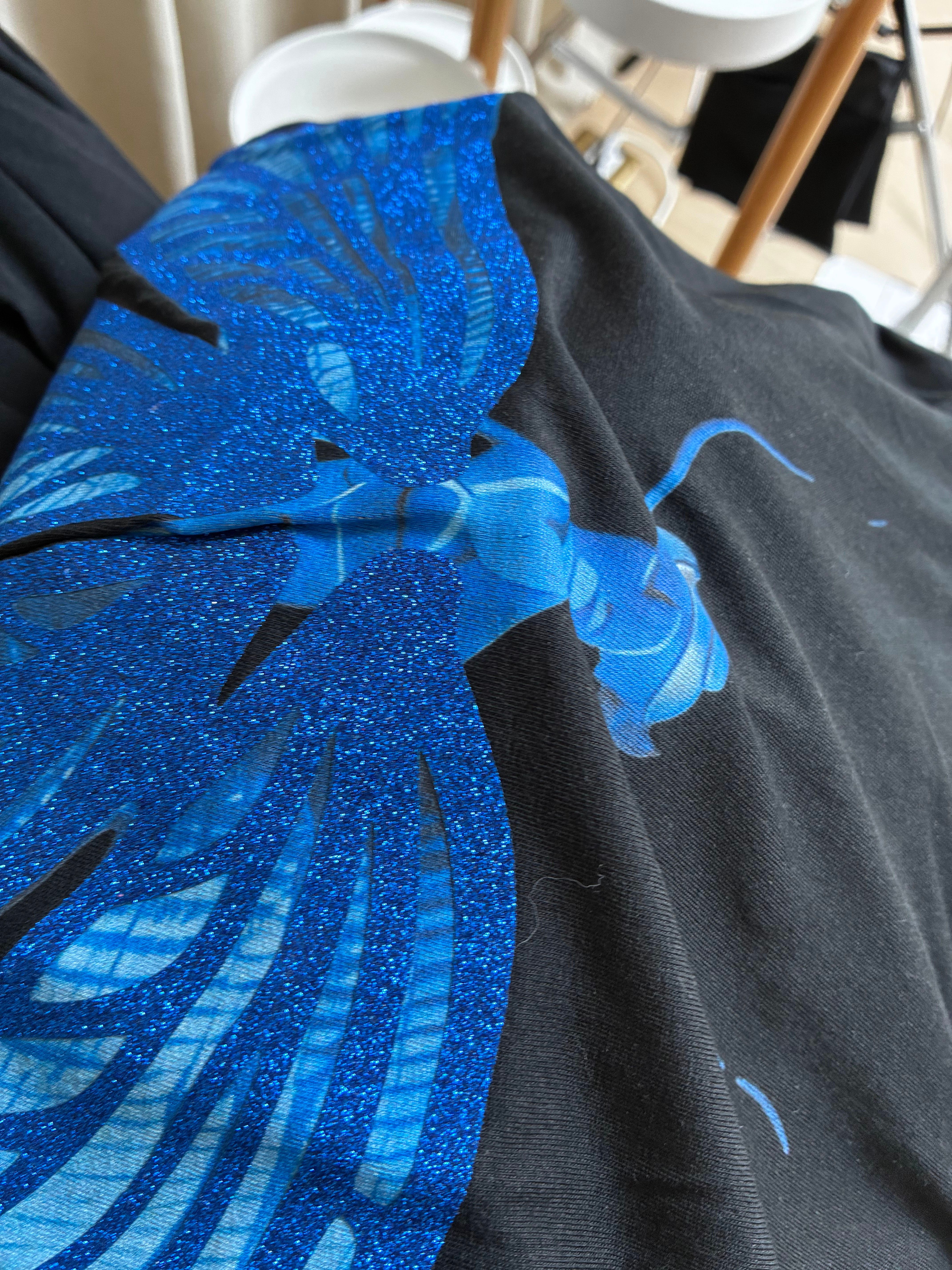
Glitter is the loudest of the six. Coarse flakes are embedded in the film, giving it the strongest visual punch on the list, and it stays bright pressed onto black or navy where a flat printed color would go dull.
What it gives up. Coarse particles can't render fine linework. Small text, thin outlines, and detailed line art blur into a sparkly mass instead of staying crisp. The particle size sets a floor on how much detail survives, and that floor is higher than most designers expect.
The material also runs thicker than the others. That thickness is part of why it commands attention and part of why it's the wrong pick for a small discreet chest logo, where the weight reads as bulk rather than presence.
What to do about it. Design for glitter rather than converting to it. Bold, simple, closed shapes. If a design only works at small sizes with thin strokes, it needs a different finish, and no amount of press adjustment changes that.
4. Sparkle: it doesn't survive a product photo
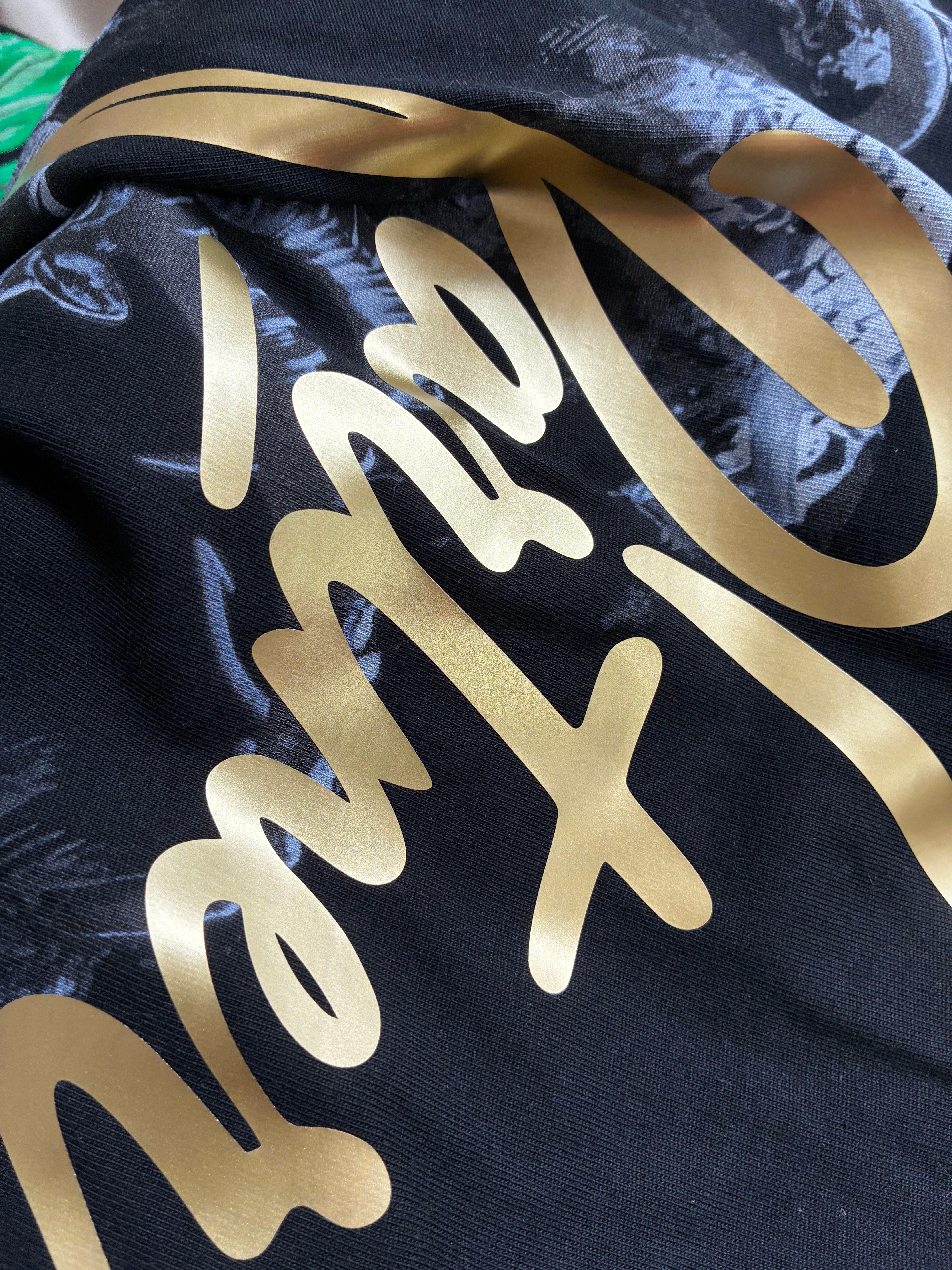
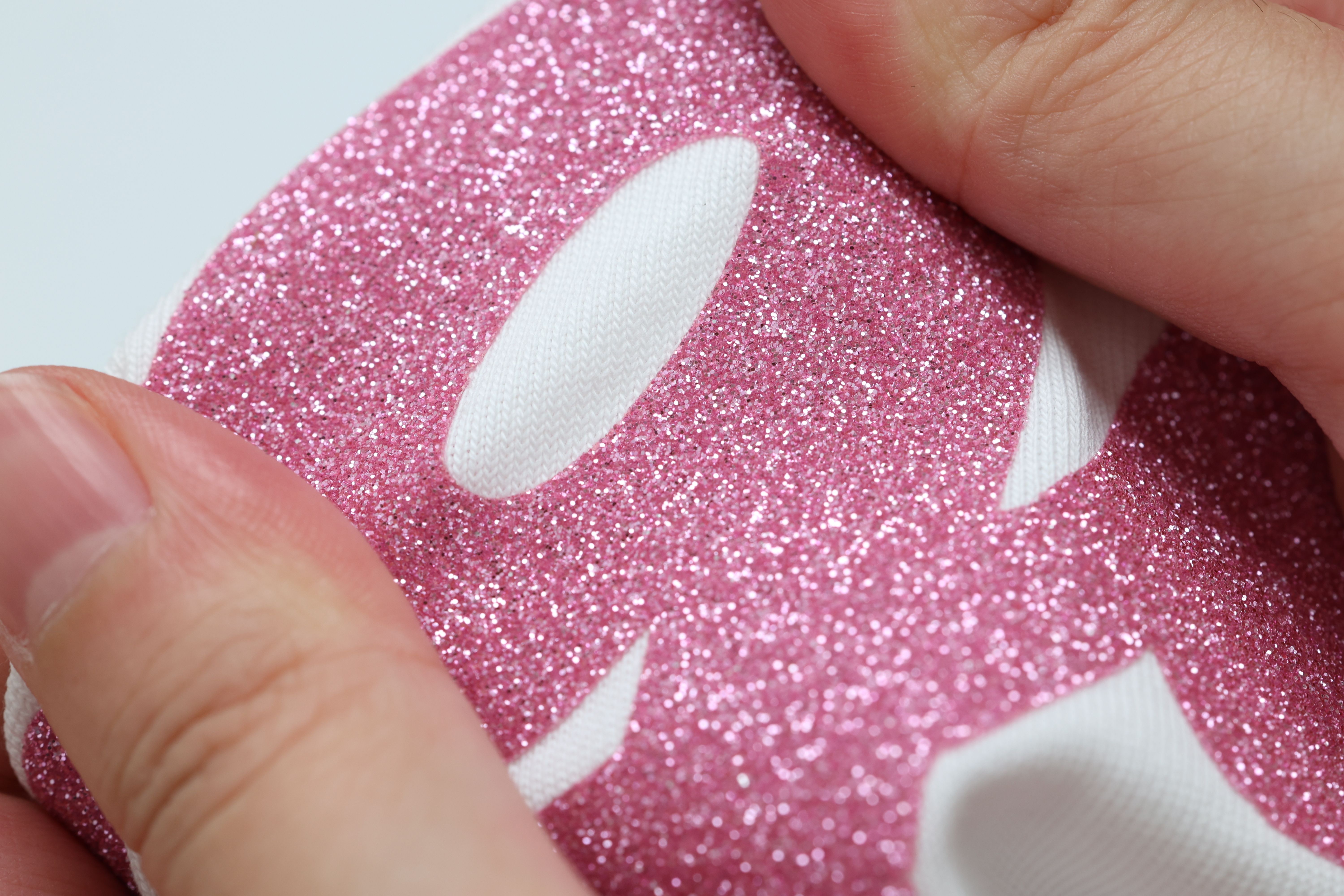
Sparkle is usually what people mean when they ask for glitter but not that much glitter. Fine micro-shimmer embedded in the film's surface rather than sitting on top of it in visible flakes, closer to shimmer in eyeshadow than glitter on a party shirt.
What it gives up. That subtlety doesn't photograph. Product images tend to flatten the shimmer into a plain solid color, so a shopper scrolling thumbnails may never register that the finish exists at all.
This is the finish with the widest gap between how it performs on a garment and how it performs in a listing. It earns its keep in the customer's hands, not in the cart.
What to do about it. If your sales channel is a marketplace grid where the thumbnail does all the work, sparkle is working against you. If your customer holds the product first, at a market, a pop-up, or through a sample, it's doing something no flat print can. Match the finish to how the product actually gets sold.
5. Velvet: it reads weaker from across the room
Velvet is built for touch first. Ultra-fine short pile with a slight tactile friction, similar to running a hand over fine suede, with a genuinely raised feel you could identify with your eyes closed.
What it gives up. The pile that creates the texture absorbs light rather than reflecting it. From ten feet away the design can read weaker than a flat glossy print of the same size. It rewards someone standing close and loses definition on someone scanning a rack from across a room.
Large velvet placements also run warm. A pile texture traps a thin layer of air against skin, so a full-back velvet design feels noticeably warmer to wear than the same design in a flat finish. That matters more for a summer tee than a winter hoodie.
What to do about it. Use velvet where the customer will be close to it. A chest mark, a sleeve detail, a neck-adjacent placement. It's a finish for the moment of unboxing and the moment of touching, which is a real moment in a premium purchase and worth designing for.
6. Glow: the daytime color and the glow color are two different colors
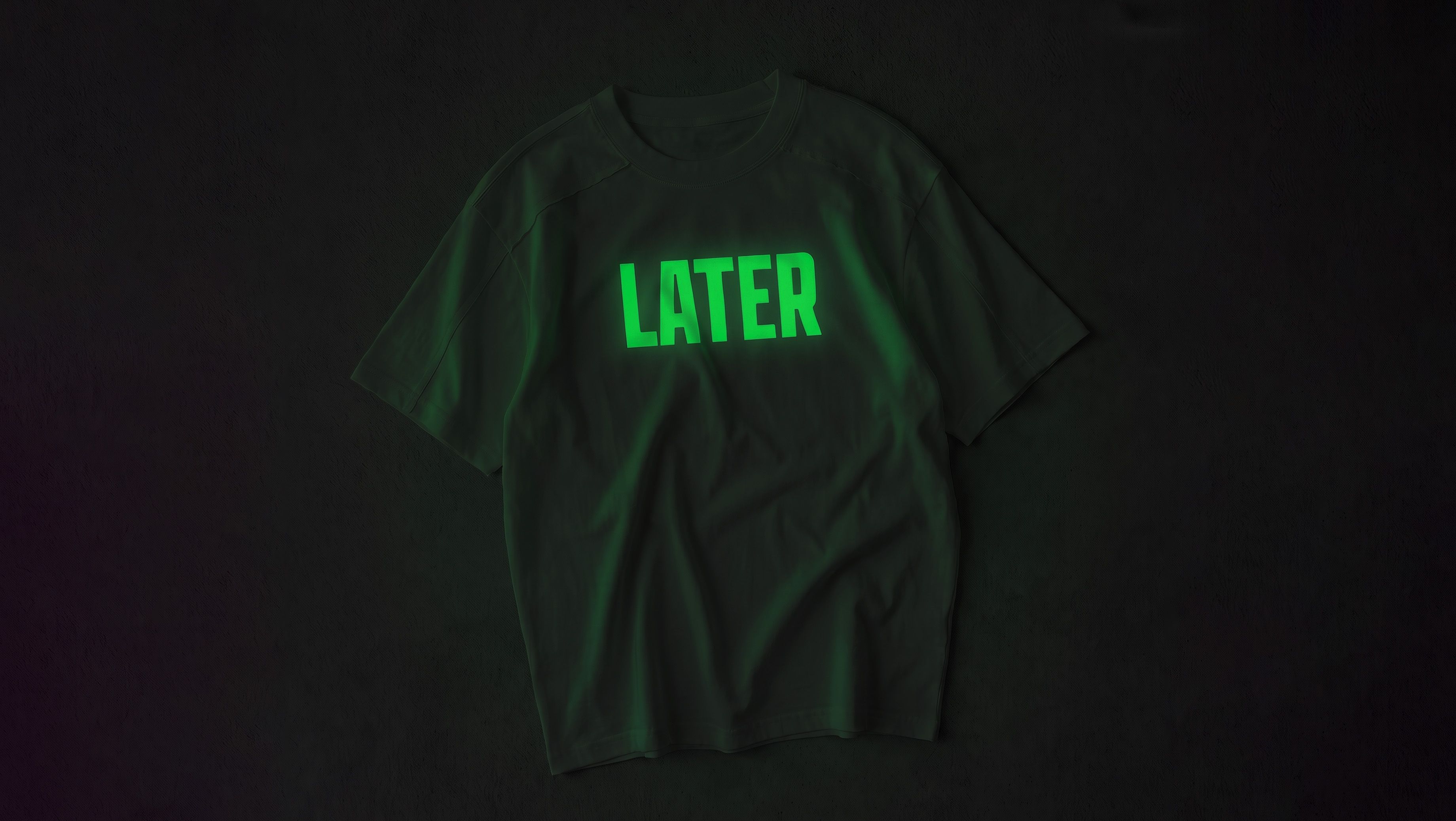
Glow film looks like an ordinary colored print in daylight, charges under any light source, and glows once the room goes dark. It picks up charge from sunlight or ordinary indoor lighting.
What it gives up. The compound that makes a film glow also changes its daytime appearance. A design that looks pale green in your file might press as a chalky off-white in daylight and only shift to green once it's actually dark.
Plan for two colors, not one. Don't expect a close match between the daytime read and the glow read, and don't approve a design based only on how it looks on screen.
What to do about it. Decide which of the two colors is the one that sells the product. If the daytime appearance is what a customer sees before buying, design for that and treat the glow as the reveal. If the product exists for a dark environment, accept that the daytime version will look muted and don't fight it.
7. Premium Matte: nothing extra, on purpose
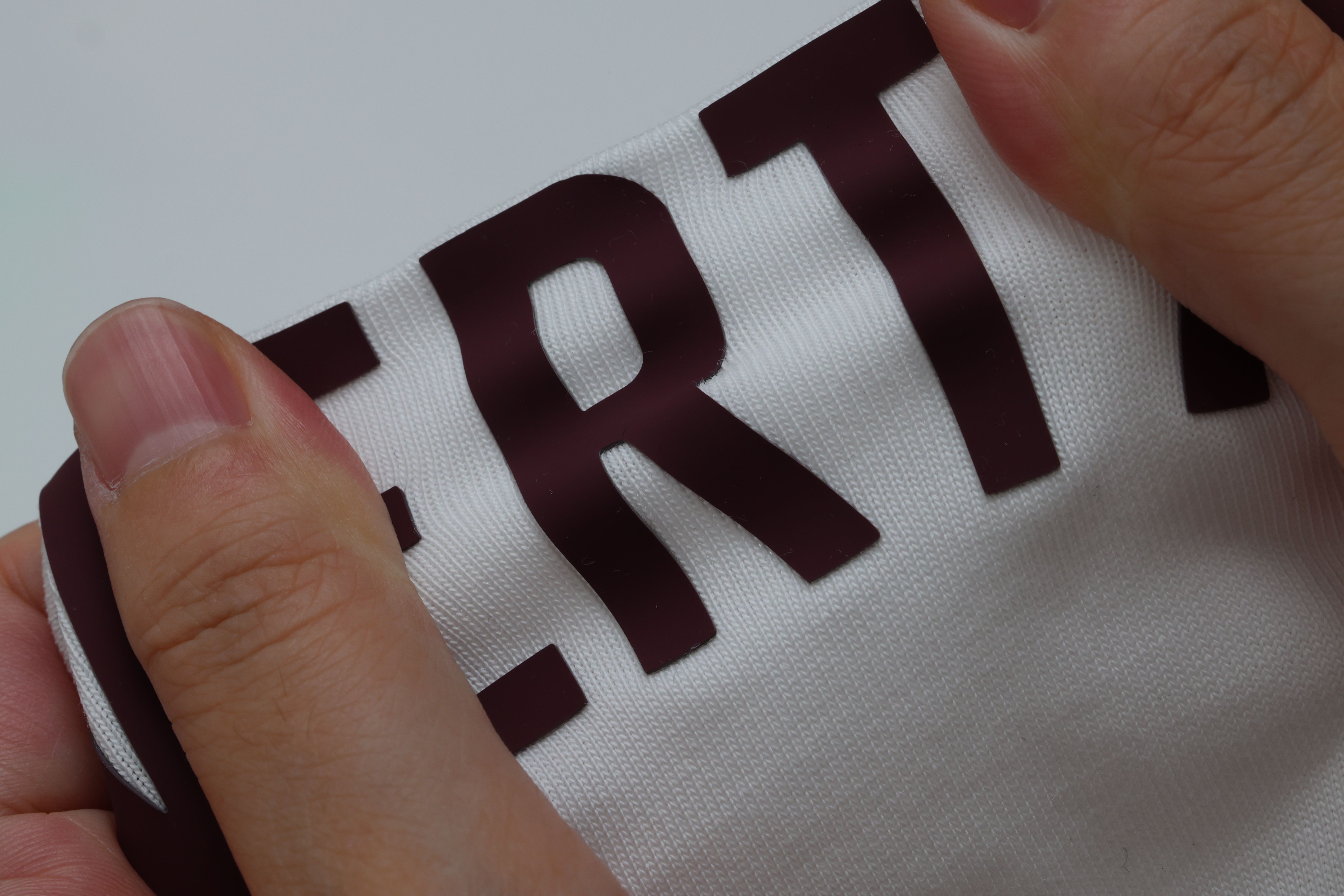
Premium Matte does the opposite of every other finish on the list. Completely non-reflective, silicone-like feel, full opacity, and it presses flat against the fabric instead of sitting up off it. What it delivers is a clean, accurate shape with sharp edges and a color that reads exactly as flat and opaque as the file intended.
What it gives up. Everything the other five are for. No texture bonus, no light behavior, no reveal. A design that depends on being felt or on catching light needs a different finish.
What to do about it. Nothing, if shape and opacity are what the design needs. This is the finish that doesn't ask the customer to notice the material, which is the correct choice for a lot of brand marks. The mistake is picking it and then being disappointed that it isn't special, when unremarkable surface behavior is the entire point.
8. Four limits that apply to all six
These aren't finish-specific. They come from the technique itself.
Fine lines and tight negative space can burn away
Cutting concentrates heat. A line or gap below the minimum width gets burned away rather than cut cleanly, leaving a stroke missing or a shape deformed. The minimum is 1.5mm (0.06 inches) for both line thickness and the gaps between elements — keep any stroke at or above that.
This is the cause of most "why did my fine linework disappear" questions. It happens before the shirt is ever pressed, at the cutting stage, and it isn't recoverable at the press.
Layers can't stack
Pressing one film layer over another reduces the top layer's adhesion and makes it more prone to lifting after a few wash cycles. A design that calls for overlapping vinyl needs to be rebuilt as side-by-side elements.
Not every finish takes a needle afterward
Combining Heat Transfer Vinyl with embroidery on the same placement sounds simple until a needle has to pierce the film. Metallic, reflective and thick-texture finishes resist a clean needle pass, so stitching over them tends to skip or look ragged. Flatter, thinner finishes make a safer base if embroidery is going on top.
Note the distinction: this is about stitching through film in the same spot. Running embroidery on one part of a garment and Heat Transfer Vinyl on another is a different thing entirely and doesn't have this problem.
Large solid fills change how the garment wears
A big block of film adds weight and stiffness that a same-size direct-to-garment print doesn't carry. That's a fair trade for effects only film can produce, but it's also why a Heat Transfer Vinyl mockup doesn't always predict how a finished garment hangs or moves.
9. Matching finish to how the product sells
The tradeoffs above sort cleanly once you ask a different question: where does the customer encounter this product?
| How it sells | Finishes that hold up | Finishes that fight you |
|---|---|---|
| Marketplace thumbnail | Glitter, Metallic (with side lighting), Premium Matte | Sparkle, Velvet |
| In person, handled before buying | Velvet, Sparkle, Glitter | None particularly |
| Seen at distance, worn in public | Glitter, Metallic, Premium Matte | Velvet, Sparkle |
| Dark venues, night events | Glow | Everything else, by definition |
| Small brand mark, quiet branding | Premium Matte, Sparkle, Velvet | Glitter |
A finish that fights you isn't unusable. It means the effect is doing its work somewhere the customer isn't looking, and you're paying for something they won't see.
10. Choosing between Heat Transfer Vinyl, DTG and embroidery
The decision comes down to what the effect physically depends on.
Surface optics. Sheen, glow, embedded shimmer, or flat non-reflective opacity. Heat Transfer Vinyl is the technique with a real answer here. Fiber-based methods can't fake a reflective or phosphorescent surface, because they don't have a surface separate from the fabric.
Fine detail, photographic color, smooth gradients. Direct-to-garment fits better. Pigment pushed into fiber holds detail and blends color in ways cut film can't.
Three-dimensional texture with real height and shadow, visible from across a room. Embroidery does this better than film or ink.
Most garments that look expensive use more than one of these, with each technique doing the part it's actually good at.
11. Frequently asked questions
Which Heat Transfer Vinyl finish is most durable?
Durability across the six is more similar than the visual differences suggest, because all of them bond the same way. What varies is how visible wear is when it happens. A textured finish shows abrasion differently than a flat one. Washing inside out in cold water and skipping direct ironing matters more than the finish choice.
Why did my design come back in one solid color?
The cutter reads the outline of your design, not its color data. Everything inside that outline gets replaced by the color of the film you selected. A blue logo cut from gold glitter comes back solid gold glitter.
Can I put two finishes on the same garment?
Yes, as separate elements side by side. What doesn't work is stacking one film on top of another in the same spot.
Why does my metallic print look gray in photos?
Your light source is probably directly in front of or above the garment. Reflective surfaces need light hitting at an angle to bounce sheen toward the camera. Move the light to the side and shoot again.
Can I embroider over a Heat Transfer Vinyl design?
On the same spot, it depends on the finish. Metallic and thick-texture films resist a clean needle pass. On different parts of the same garment, there's no conflict at all.
My design has thin lines. Will they survive?
Anything below 1.5mm (0.06 inches) in stroke width or gap width is at risk of burning away during cutting. Thicken the strokes or move that element to a different technique.
Which finish is best for a small chest logo?
Premium Matte for a clean brand mark, Sparkle if you want the customer to notice something up close, Velvet if the product is premium and gets handled. Glitter is usually wrong at that size, because its thickness reads as bulk on a small placement.
Does the finish change how I should photograph the product?
For Metallic and Sparkle, yes, significantly. Both depend on light behavior that flat studio lighting removes. For Premium Matte and Glitter, standard product photography is fine.
12. Making it with PODpartner
Once you know which finish the design actually needs, the next step is putting it on a real product and holding it. All six finishes on this page — Metallic, Glitter, Sparkle, Velvet, Glow, and Premium Matte — are available at PODpartner, on garments and on hats, from a single unit. You can place one and run it through the exact test that matters for your finish: photograph the metallic under your own lighting, wash the glitter, hold the velvet, take the glow into a dark room.
Because you can order one at a time, choosing a finish stops being a guess. Make the piece, check it against the tradeoff the finish carries, and only scale once it reads the way you intended. You can also place up to five separate Heat Transfer Vinyl elements on a single area and mix materials across them, or combine Heat Transfer Vinyl with embroidery and DTG through Hybrid Process when a design needs more than one technique doing its part.
Every finish trades something away — sheen for angle, impact for detail, texture for distance. The right one depends on where your customer meets the product, not on which looks best in a swatch.
PODpartner runs all six Heat Transfer Vinyl finishes on garments and hats, from a single unit — so you can make the exact piece, hold it, and decide with the product in your hands instead of on a screen.
Explore Premium Heat Transfer Vinyl →Specifications, thickness ranges and current pricing for all six finishes are covered in the Heat Transfer Vinyl materials and pricing guide. Specs change; check current values before finalizing a design.