
 USD

Trending Streetwear Graphic Tee Styles to Design and Sell 2026


Everyone keeps saying the streetwear graphic tee market is overcrowded. It's not. It's just flooded with lazy work.
Scroll through most stores and you'll see the same recycled graphics, the same predictable layouts, the same ideas that were already trending two years ago. That's not competition. That's noise.
The truth is, graphic tees are still the fastest way to test ideas and build a real identity in streetwear. You don’t need a full cut-and-sew line or massive capital. One strong design on the right blank can tell people exactly who you are.
What’s changed going into 2026 is the shift away from empty hype. Big logos and surface-level aesthetics don’t hit the same anymore. People want something that feels connected to a scene, a mindset, or a subculture. If your graphic doesn’t say anything, it doesn’t matter how good it looks.
The Core Design DNA of a High-Selling Streetwear Graphic Tee
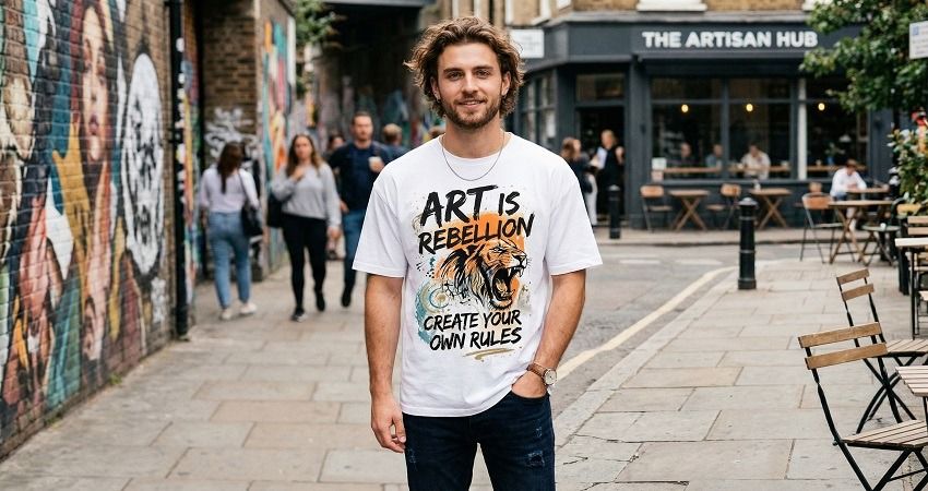
The biggest mistake new designers make is thinking this is about making something “cool.” It’s not. It’s about making something timely.
Cultural timing beats pure visual appeal every time. A rough, imperfect design tied to the right moment will outsell a polished but irrelevant one without hesitation.
That’s why designing for everyone is a losing game. The brands that are actually moving product are speaking directly to specific groups. Anime heads. Underground rap fans. Car culture obsessives. Techwear purists. If your design tries to appeal to all of them, it ends up resonating with none.
Then there’s the garment itself, which too many people treat like an afterthought. It’s not. A proper streetwear graphic tee lives or dies on the blank. Heavyweight cotton, slightly boxy cuts, and washed finishes give the piece presence before the graphic even comes into play. A great design printed on a cheap, thin tee feels like a knockoff, no matter how good the artwork is.
Color is another place where people overdo it. Loud palettes had their moment. Now it’s more controlled. Washed blacks, faded browns, dusty neutrals, with contrast used sparingly. Let the texture and print carry the weight instead of throwing ten colors at the fabric.
And placement? The front-center graphic is getting tired. The energy has shifted to oversized back prints, off-center chest hits, and small details that reward attention. The best tees don’t scream everything at once. They reveal themselves as you look closer.
The Streetwear Graphic Tee Styles Dominating 2026
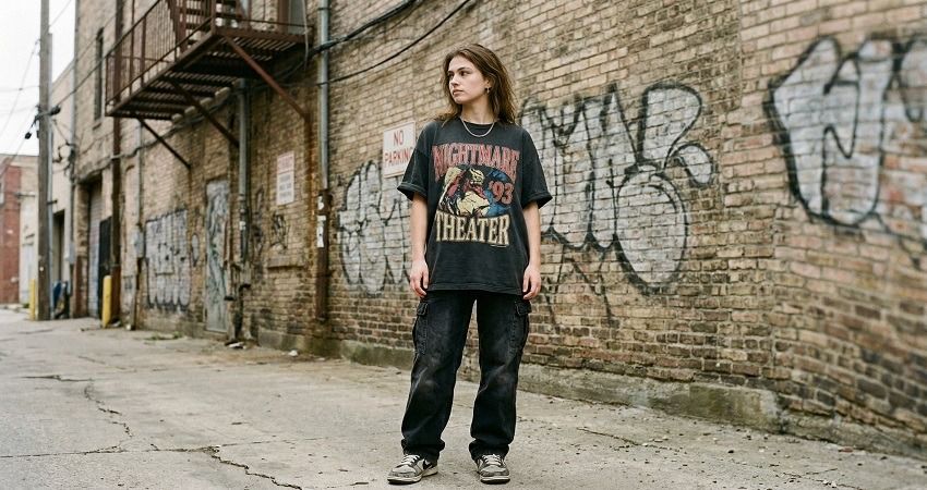
The trends that are actually moving aren’t random. They all tap into nostalgia, identity, or controlled chaos in some way.
Distressed vintage graphics are everywhere right now, but the good ones don’t look “designed.” They look discovered. Cracked ink, faded prints, slightly off-register details. Think less “clean brand drop” and more “found this in a box from 1998.” That worn-in feeling makes a brand feel established, even if it launched last month.
AI-enhanced surrealism is another lane, but there’s a clear divide. The low-effort stuff is obvious and forgettable. The strong pieces use AI as a starting point, then refine the output into something wearable. The result is strange, slightly unsettling visuals that still make sense on a tee. It’s not about showing off the tool, it’s about controlling it.
Typography-first designs are hitting hard again, especially when they carry attitude. Not long quotes or motivational lines. Sharp, aggressive phrases. Layouts that feel almost wrong on purpose. Raw fonts, awkward spacing, visual tension. When it’s done right, a few words can carry more weight than a full illustration.
Then you’ve got niche subculture graphics, which might be the most important shift overall. Brands aren’t chasing mass appeal anymore. They’re going deep into specific worlds. Anime references that only real fans catch. Motorsport visuals that feel authentic, not borrowed. Underground music aesthetics that don’t try to explain themselves. These designs aren’t for everyone, and that’s exactly why they work.
Finally, there’s the collage and chaos approach. Layered images, textures, scans, stickers, noise. At first glance it looks messy, but the good ones are carefully constructed. This style pulls from zines, early internet visuals, and bootleg culture. It feels expressive, slightly rebellious, and most importantly, human.
From Design to Product: How to Actually Sell Your Streetwear Graphic Tees
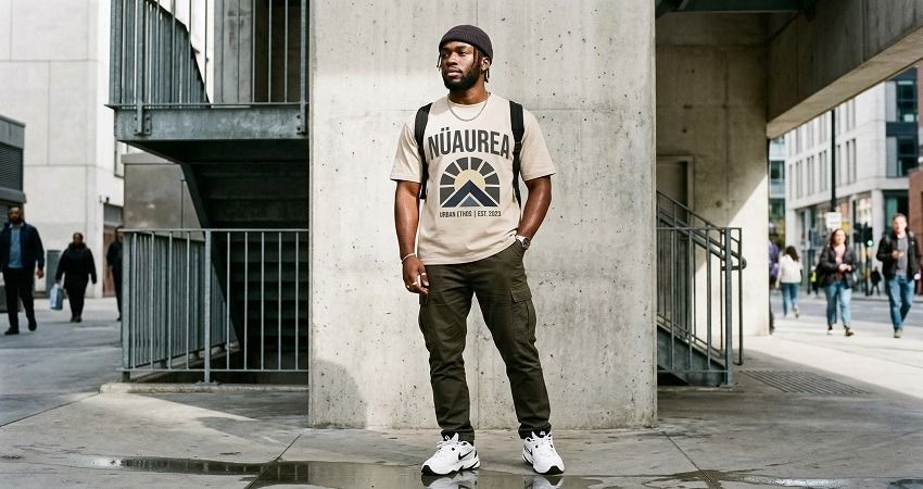
Here’s where most people fall apart. They make something that looks great on screen, then completely lose it in production.
A strong design doesn’t automatically translate into a strong product. The moment it hits fabric, everything changes. Scale, texture, ink behavior, fabric weight. If you don’t account for that, the final piece feels off.
There’s also a balance you have to respect. You want bold graphics, but the tee still has to be wearable. If it only works in a photoshoot and not in real life, people won’t keep reaching for it.
Then there’s the money side, which people either ignore or misunderstand. More colors, bigger prints, complex layouts. All of that adds cost. If you don’t think about margins early, you end up with a product that looks great but barely makes profit.
The smartest brands keep their drops tight. Not 20 designs. Maybe 3 to 5, all aligned, all intentional. That focus builds identity and reduces risk.
And production itself matters more than most people realize. Working with partners like PODpartner gives you access to streetwear-ready blanks, oversized fits, and jumbo DTG printing that can handle large, detailed graphics without cracking or fading. That means you can actually test bold ideas properly, without committing to massive inventory upfront. You’re not guessing. You’re learning in real time while still delivering a premium product.
Mistakes That Quietly Kill Most Streetwear Graphic Tee Brands
The obvious mistakes are easy to avoid. It’s the subtle ones that do the damage.
Trend-chasing is a big one. By the time most people jump on a trend, it’s already declining. The brands that win are the ones paying attention early, then interpreting the trend in their own way.
Overdesigning is another silent killer. More elements don’t make a design stronger. They just make it harder to understand. The best pieces usually have one clear idea and commit to it fully.
Cheap blanks ruin everything. You can’t build a premium perception on a flimsy foundation. People might buy once, but they won’t come back.
A lot of brands also lack a cohesive identity. One tee looks vintage. The next looks futuristic. The next looks like a meme. There’s no thread connecting them. Without that consistency, there’s no brand, just products.
And then there’s overproduction. Too many designs, too early, without knowing what actually sells. That’s how you end up stuck with inventory that no one wants.
The Designers Who Win in 2026 Think Like Editors
The difference isn’t talent. It’s restraint.
Strong brands don’t try to say everything at once. They filter. They cut. They refine. They treat every design like it has to earn its place.
The streetwear graphic tee that wins in 2026 isn’t louder. It’s sharper. More intentional. More connected to something real.
And the order matters more than people think. Culture comes first. Then design. Then product execution.
Get that sequence right, and you’re not just making tees. You’re building something people actually want to wear.
Further reading

No Order Minimums

No Membership Fees

No Unsold Stock

No Quality Concerns
Only Creativity, Satisfaction, and Profits!