
 USD
USD
10 Vintage Art Styles to Refresh Your POD Product Line

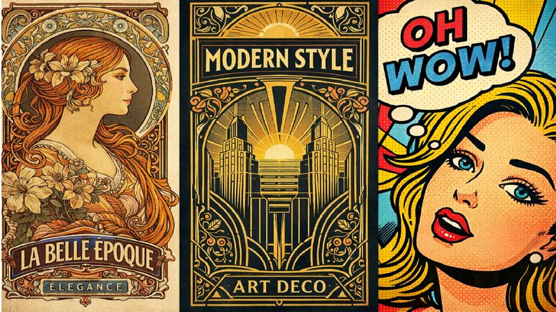
Why Vintage Styles Are a Smart Reset for POD Sellers
Not all the print-on-demand shops get out of business in one way. They plateau. The designs are not fractured, but begin to get monotonous. Same fonts, same layouts and same concepts reused until customers cease paying attention.
Vintage aesthetics will provide a fresh start without having to completely rebrand. Retro styles are non-experimental and thus they reduce friction, but they are also deliberate and thought through. The combination assists products to be noticed in oversaturated POD niches where trend-based graphics go dead in a short time.
The other benefit is long life. The designs that are vintage-inspired will not fade away as trends. In the contemporary POD workflow, sellers may now experiment with the detailed retro aesthetics without stocking them, which helps to refresh the collections more easily without needless risk-taking.
Why Vintage Art Styles Convert in Print on Demand
One of the most reliable purchasing stimuli is nostalgia and it is cross-generational. The elderly react to familiarity whereas the younger generation of buyers is attracted by the timeless beauty of their products instead of trends.
The vintage-inspired designs are also likely to be more high-end. They imply mastery, organization, and purpose and make the products less disposable. That impression tends to justify an increase in prices, particularly in the case of clothes and wall art.
Contrary to the fast-burn design trends, retro designs are timeless. The major distinction between converting designs and nonconverting designs is the adaptation. Masterful POD sellers do not imitate old art. They remake the old styles to contemporary printing, fabrics and product structures.
10 Vintage Art Styles That Work for POD Products
1. Art Nouveau–Inspired Designs
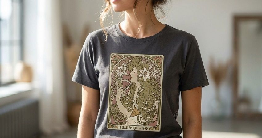
Nature Art Nouveau is a late 19th century response to industrial mass production and promoted beauty, craftsmanship and nature in motion. The style is decorative and expressive but is not overwhelming.
Art Nouveau is also effective in print on demand on apparel and posters as well as decorative prints where elegance and detail are considered sources of perceived value.
Key elements:
The use of natural elements like flowers, vines, leaves, and the human form attracts much of the Art Nouveau design. Instead of being realistic, these elements are stylized and this also produces rhythm and flow in the composition. The lines are curved and the inflexible geometry is decreased in favor of fluid motion. Ornamentation is usually in the form of boundaries or frames. By simplifying finer details, when ready to be used in POD, one can keep the clarity and still preserve the decorative nature of the style.
2. Art Deco–Inspired Designs
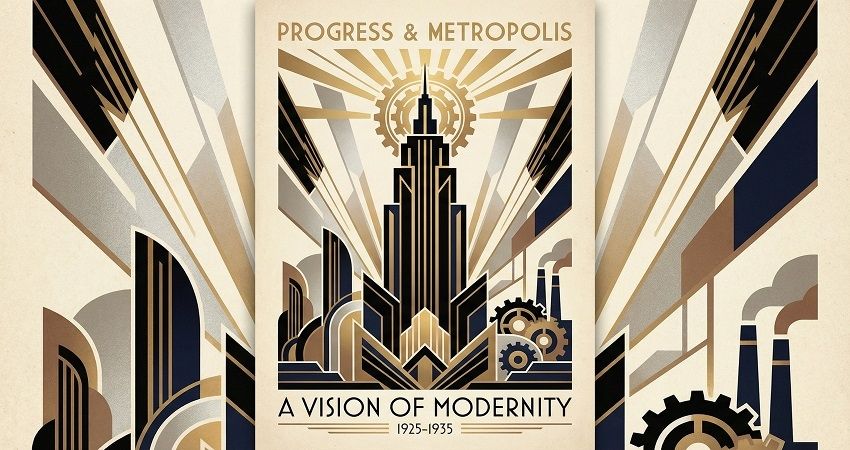
The evolution of Art Deco was the essential event that glorified modernity, structure, and luxuriousness. It is confident and purposeful in a visual sense and it is usually connoted with grace and charm.
This style works well when applied to high-end clothing, wall art and home decor where the bold layouts and contrast can be used to justify higher prices.
Key elements:
Art Deco is based on symmetry, straightness of line and powerful geometric shapes. Architectural designs tend to be architectural, using repetitive designs and meticulous alignment. The color schemes are often restrained but intense, often with dark colors, golds, or metallic-like colors. Sections that are decorative are manipulated and planned. For the polished feel, it is necessary to use precision and balance.
3. Bauhaus and Early Modernist Styles
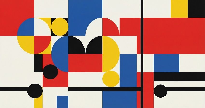
Bauhaus architecture was centered around practicality, clarity and simplicity with the ornamentation being eliminated in favor of meaningful arrangement.
This style is simple to scale and operates uniformly in both apparel and wall art in POD because of its tidy designs.
Key elements:
The designs of Bauhaus make use of plain geometric figures like circle, square and straight lines. The use of colors is intentional, with the focus in most cases being the primary colors and the neutrals. Plans are grid-based and laid out. Negative space is also significant in ensuring that designs are clear. The style is very flexible to contemporary printing due to this constraint.
4. Mid-Century Modern Aesthetics
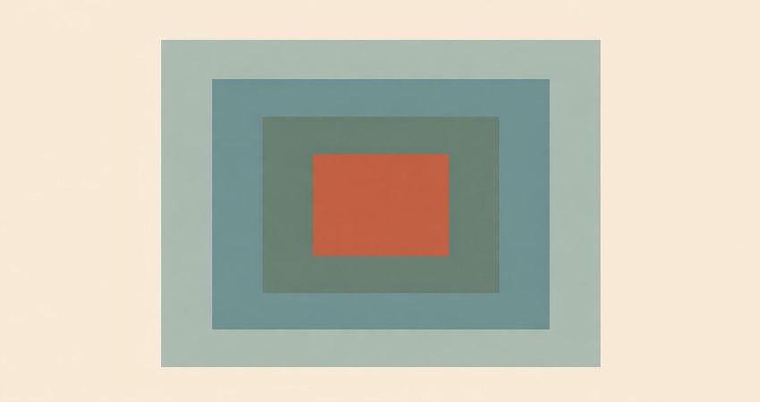
The use of organic shapes in combination with laid out structures is practiced in mid-century modern design. It is playful and also controlled and this is why the demand has always been consistent over decades.
The style is particularly effective in POD products that feature lifestyle and home-based products such as posters, pillows, mugs, and casual clothing.
Key elements:
The geometrical shapes of the midcentury designs are soft, organic, and clean. Palettes are frequently combined with neutrals that are warm and accent colors that are bright. Patterns have an easy and graphic style that is not detailed. There is asymmetry which is also balanced with caution. The general mood is friendly and positive.
5. Pop Art–Influenced Designs
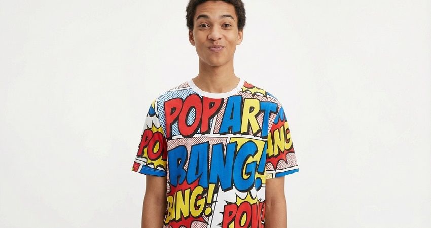
Pop art focuses on graphic narration, clear contrast, and graphic images. It was constructed in a way that would capture the eye.
Pop art is especially effective in PODs that have giftable items and customization in terms of effects.
Key elements:
Pop art involves the application of bright colors and saturated colors and heavy outlines to make a contrast. The imagery is visual and graphic and has definite subjects of interest. Text is usually active together with images. The message is reinforced by repetition and exaggeration. Space clean is used to maintain readability and usefulness of design.
6. Psychedelic and 60s–70s Retro Styles
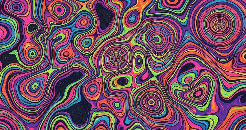
Psychedelic design is expressive, flowing, and intense to look at. It adopts distortion, movement, and experimentation.
This genre works best as statement apparel and accessories as opposed to day to day basics.
Key elements:
Psychedelic designs have flowing lines and distorted lines. Typography tends to go with and expand the composition. The color schemes are vivid and active with numerous contrasting colors. Layering makes it more complex and three dimensional. High contrast is used to ensure visual order in the chaos.
7. Optical and Geometric Illusion Styles
Optical art is concerned with creating a movement and depth in repetition and contrast.
This style is unique in POD in collections that are fashion-forward and uniqueness is a value-creating factor.
Key elements:
Optical designs are based on the repeated patterns, which are laid out in an accurate fashion. The contrast is intense creating the illusion of movement. Color palettes are usually restricted to ensure that there is clarity. Minor variations of spacing can be very radical. This must be done cleanly in order to maintain the effect.
8. Memphis-Inspired Retro Designs
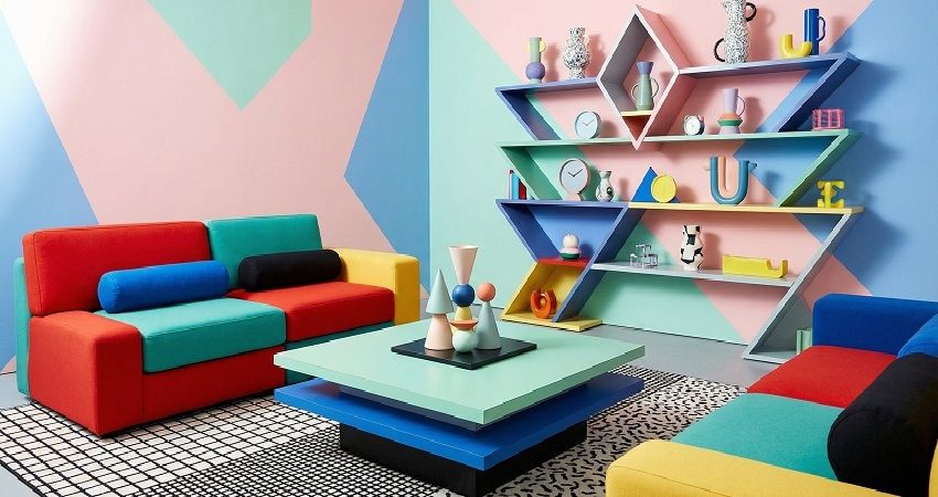
Memphis design does not uphold minimalism but vivid expression. It is whimsical, noisy and unorthodox.
It is the most effective style when it comes to home decor and lifestyle products with personality as a selling factor.
Key elements:
Memphis designs are made of irregular shapes and asymmetrical designs. The combinations of colors are vivid and usually surprising. Patterns are felt as overlay and unstructured, but not organised. Visual power prevails in preference to nuance. Still, it is necessary to use balance to make compositions readable.
9. Vintage Typography and Lettering Styles
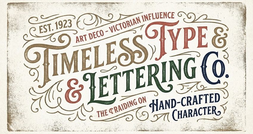
Vintage typography aims at the tone, character, and readability and not the complexity.
Typography-based designs will continue to be do much of the heavy lifting in POD, and particularly when it comes to clothing.
Key elements:
Vintage lettering consists of serif fonts, scripts and hand-drawn styles. There is a tendency of subtle imperfections in letterforms which contributes to the warmth. Space and alignment are well taken into account. There is limited use of ornamental flourishes. It remains focused on clarity and still has character.
10. Retro Travel Poster and Advertising Styles
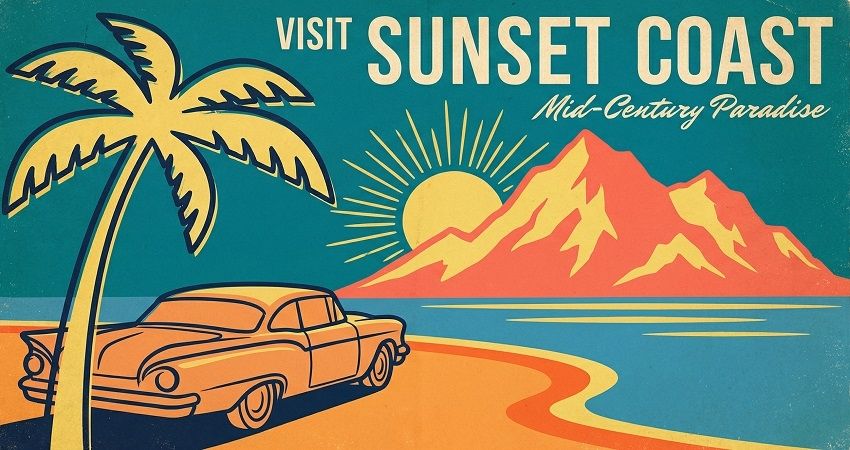
Madison and retro travel designs are based on composition and mood, instead of detail, to make the design appear nostalgic.
They are best used as wall art, clothing and theme POD collections.
Key elements:
These designs rely on bold central imagery which is backed by the use of minimum text. Color schemes are rather subdued and low-key. Forms are not so detailed but simplified. Structures direct the gaze of the viewer with a good hierarchy. The framing makes the work of art look like a classic poster.
Turning Vintage Styles Into POD Products That Actually Sell
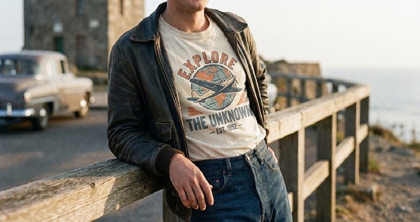
Not all vintage styles will be applicable to all products. Today, clothing has a tendency towards striking contrast and legibility and wall decoration towards finer detail. The correlation between style and product category is more important than the style.
Color pallets usually have to be modified to print on contemporary fabric. Sample testing prevents the occurrence of washed-out results particularly when the retro tones are muted. Modern POD vendors use the services of modern POD platforms such as PODpartner to pilot complex vintage designs using DTG printing with no minimum order requirements, which makes experimentation simpler and less risky.
Rebranding a collection but only refreshing their catalogs with small, focused collections can enable the sellers to test demand without confusing customers.
Building a Timeless POD Brand With Vintage Design
Vintage styles do not constitute trends. They are design lanes that are long-term.
It is always a good idea to refresh your product line with retro looks and help keep customers excited without losing their familiarity. Consistency is key. The visual direction creates trust and recognition in the long run.
Think, experiment, test what is interesting and improve accordingly. The vintage design is the one that will reward patience, and the patience will generally be rewarded in the print on demand.
Further reading

No Order Minimums

No Membership Fees

No Unsold Stock

No Quality Concerns
Only Creativity, Satisfaction, and Profits!