
 USD
USD
The "Wet-on-Dry" Revolution: Why Your POD Samples Look Dull (And How to Fix It)

We’ve all been there.
It starts with a spark of inspiration. You spend hours—maybe days—perfecting a design in Photoshop or Illustrator. You meticulously calibrate the neon glows, you fine-tune the semi-transparent smoke effects, and you ensure the blacks are deep, rich, and abyssal. You upload it to a major Print-on-Demand (POD) platform, order a sample, and wait with the kind of excitement usually reserved for Christmas morning.
But when the package finally arrives and you tear open the poly mailer, your heart sinks.
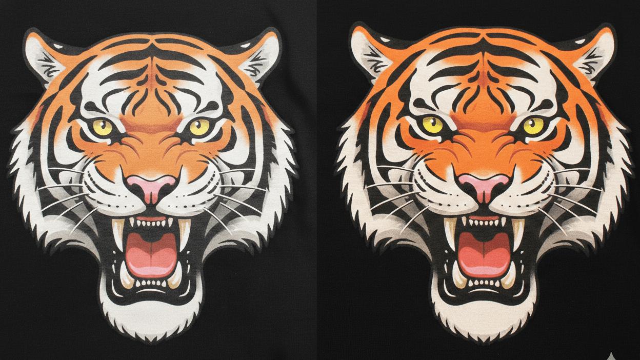
The colors look muted, tired, and washed out. The razor-sharp lines you drew are fuzzy and soft. That cool "outer glow" effect you designed just looks like a muddy gray blob. The design that looked like a masterpiece on your 4K monitor looks like a cheap promotional giveaway on the shirt.
Naturally, you start troubleshooting: “Did I mess up the RGB to CMYK conversion?” “Is my resolution too low? Should I have used 600 DPI?”“Maybe I should double the layers to make it thicker?”
Here is the uncomfortable truth: It’s probably not your design. It’s the printer.
I. The Myth: "It’s an RGB Issue"
Before we dive into the mechanics of the machines, let's kill the most common myth in the industry.
When you complain to a massive POD supplier about dull colors, their customer support team usually has a canned response ready to copy and paste:
"Your design was created in RGB (screen colors), but we print in CMYK (ink colors). The shift in color is normal because ink cannot be as bright as a computer screen."
This statement is technically true, but it is functionally a lie.
Yes, a computer screen emits light, and ink reflects light. You will never get a neon green on a shirt that burns your retinas like it does on an iPhone. However, modern RIP (Raster Image Processor) software is incredibly advanced. It is designed to translate RGB data into the closest possible CMYK match with high fidelity.
Unless you are using out-of-gamut electric neons that physically cannot exist in nature without radiation, the color profile is rarely the main culprit for a completely washed-out print.
If your red looks like rust, your royal blue looks like navy, or your black looks like charcoal gray, it is not a software problem. It is a chemistry problem. It’s not about the file you sent; it’s about what happened to the ink the moment it hit the fabric.
II. The Industry Standard: The "Wet-on-Wet" Trap
To understand why your prints look dull, you have to understand the business model of the giant POD supplies(Printful, Printify, Gelato, etc.).
These companies compete on one metric: Speed.
They need to print 10,000, 20,000, or 50,000 shirts a day. To achieve this industrial scale, they must eliminate every possible second of "downtime" in the production line.
To do this, they utilize a technique known as Wet-on-Wet Printing.
How It Works
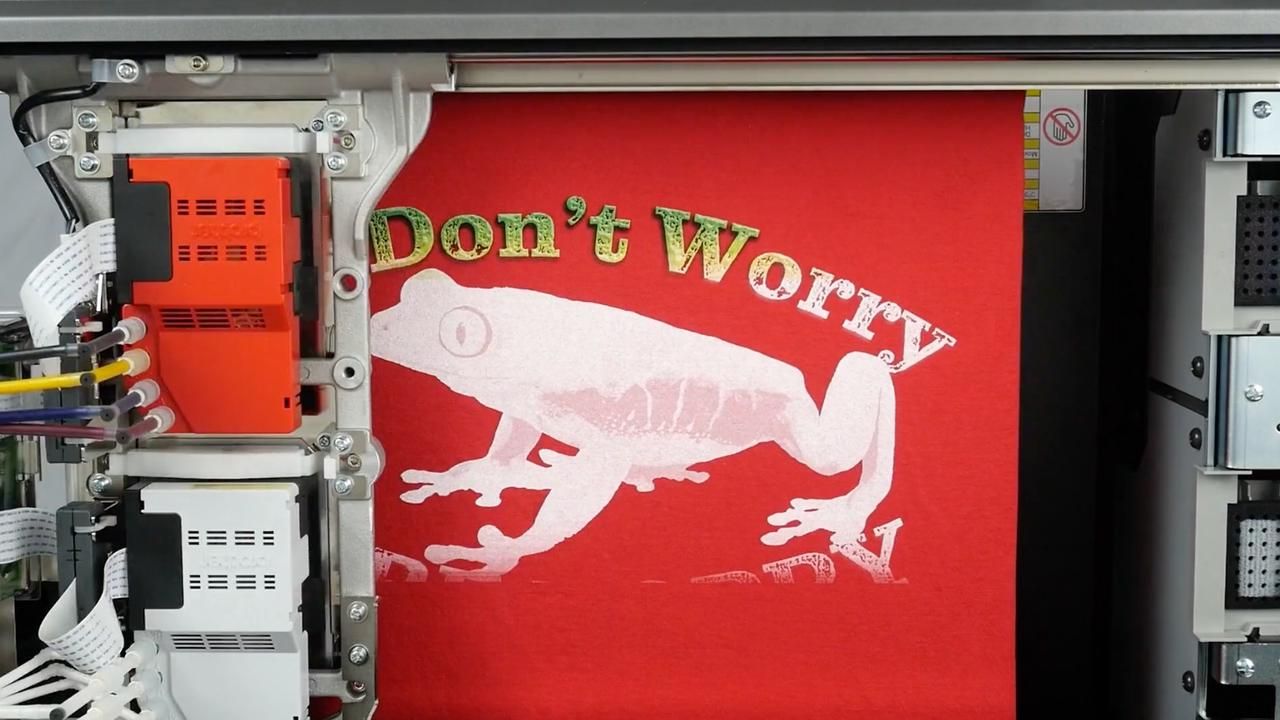
1. The Spray: The machine sprays a liquid "pretreatment" (a primer that helps ink bond to fabric) onto the shirt.
2. The Print: Immediately after—sometimes within seconds—while the pretreatment is still wet and soaking into the fabric, the machine sprays the CMYK ink on top.
The Physics of Failure
Think of this like painting watercolors on a wet paper towel.
1. Dilution and Bleeding
Because the ink hits a wet surface, it begins to dilute instantly. The water in the ink mixes with the water in the pretreatment. The pigments, instead of staying tight and concentrated, spread out. This is why your "razor-sharp" lines look fuzzy on a cheap print. The ink has physically migrated from where it was supposed to be.
2. Absorption (The "Sponge Effect")
Cotton is a natural fiber; it acts like a sponge. In a Wet-on-Wet process, the fabric fibers are swollen with liquid. When the ink lands, it doesn't sit on top of the shirt; it soaks into the shirt.
- Why this matters: Color vibrancy comes from light reflecting off the pigment. If the pigment is buried deep inside the cotton fibers, light cannot hit it and bounce back to your eye. The result is a color that looks "muted" or "dead."
3. Fibrillation
This is the enemy of high-end streetwear. Fibrillation happens when the tiny fibers of the shirt stick up through the ink layer. In Wet-on-Wet printing, the wet ink cannot mat down these fibers effectively. After one wash, these fibers break through the print, giving the design a "fuzzy" or "vintage" look—even if you wanted a clean, modern look.
Big platforms love Wet-on-Wet because it cuts production time in half and reduces labor costs. It is the "Fast Food" of printing: cheap, consistent, but ultimately lacking in substance.
III. The PODpartner Standard: The "Wet-on-Dry" Revolution
At PODpartner, we made a conscious decision: we are not in the "Fast Food" business. We are in the "Fine Dining" business.
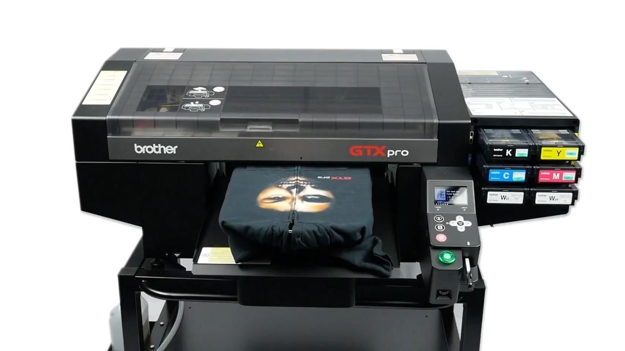
We refuse to compromise quality for speed. That is why we utilize the Wet-on-Dry technique, powered by our fleet of industrial Brother GTX printers.
How It Works
The difference lies in one crucial, time-consuming step that most competitors skip.
1. Pretreatment: We spray the pretreatment liquid onto the garment.
2. The Cure (The Secret Sauce): This is where the magic happens. Before the shirt ever touches the printer, we take the pretreated garment and run it through a heat press or a tunnel dryer. We bake the shirt until the pretreatment is 100% dry.
3. The Print: Only then, once the shirt is dry and the pretreatment has formed a hardened "shell" on the surface, does it enter the printer.
The Visual Difference
1. The "Canvas" Effect
Imagine trying to paint on raw, rough wood versus painting on a smooth, primed canvas.
By drying the pretreatment first, we create a smooth, crystallized surface on top of the fabric. When the Brother GTX sprays the ink, the droplets land on this stable surface. They do not soak in. They sit proudly on top.
- The Result: Maximum pigment density. The light hits the ink and reflects directly back to the eye. Reds are fire-engine red. Yellows are sunshine bright.
2. Chemical Isolation
Because the surface is dry, the Cyan, Magenta, Yellow, and Black inks do not mix with the pretreatment liquid. They only mix with each other, exactly as the RIP software intended. This ensures that the color chemistry remains pure.
3. Fibrillation Control
The heat-pressing step in the Wet-on-Dry process physically flattens the cotton fibers, locking them down under the hardened pretreatment layer. This means your print surface is smooth like a sheet of paper, not fuzzy like a peach.
IV. The "Impossible" Designs: Smoke, Glows, and Transparencies
This is where Wet-on-Dry truly separates the pros from the amateurs.
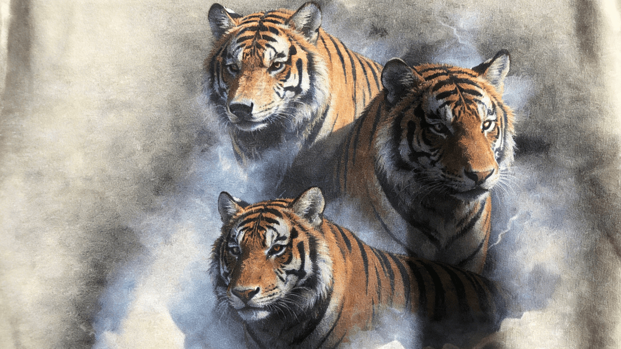
If you are designing modern streetwear, you likely use complex effects: semi-transparency, smoke, soft drop shadows, or gradients fading into the shirt color.
The "White Underbase" Challenge
To print color on a black shirt, the printer must first lay down a layer of White Ink (the underbase).
- In Wet-on-Wet: The machine tries to print a 50% opacity white smoke effect on a wet shirt. The white ink dissolves into the wet primer. The machine cannot distinguish between "50% opacity" and "wet mush." Your smoke effect turns into a solid, chunky white block or disappears entirely into the fabric.
- In Wet-on-Dry: Because the canvas is stable, the Brother GTX can lay down microscopic dots of white underbase with surgical precision. It can print a dot of white, skip a space, and print another dot.
This precision allows us to capture the "fade." It allows us to print a glow that actually looks like it's glowing, rather than just a gray circle. Wet-on-Dry is the only way to properly print transparency in DTG.
V. Why PODpartner Choose Brother GTX
Process is nothing without the right tools. We don't just use any machine; we rely on Brother GTX technology.
In the world of industrial printing, there are machines built for "throughput" (speed) and machines built for "fidelity" (quality).
- Competitor Machines (e.g., Kornit): Often used by the giants. These are amazing machines for volume. They are designed for the Wet-on-Wet process. They are the "City Bus" of printers—efficient, reliable, moves a lot of people, but not a luxury ride.
- Brother GTX: This is the "Ferrari." It is engineered specifically for high-resolution, Wet-on-Dry printing. It uses advanced Innobella Textile Inks that have a higher viscosity and color gamut than standard bulk inks.
While other machines prioritize how fast they can spray ink, Brother prioritizes where the ink lands. The print heads are capable of 1200 DPI (Dots Per Inch) resolution, ensuring that even the smallest text on your neck label is legible.
This is why smaller, high-end indie print shops often produce better quality than massive fulfillment conglomerates. At PODpartner, we have taken that "indie shop quality" and scaled it up to meet your business needs.
VI. The Business Case: Why Quality is a Retention Strategy
You might be thinking, "Okay, the tech is cool, but does it matter for my business?"
Absolutely.
In the world of E-commerce, Customer Acquisition Cost (CAC) is rising every year. It is expensive to get a new customer to buy from you. The only way to build a profitable, sustainable brand is through Lifetime Value (LTV)—getting that customer to come back and buy again.
- Scenario A (Cheap Print): A customer buys a hoodie. It arrives looking dull. They wear it once, wash it, and the print fades. They might not return it (too much hassle), but they will never buy from you again. You have lost that customer forever.
- Scenario B (Premium Print): A customer buys a hoodie. It arrives looking vibrant. The colors pop. They wash it, and it still looks new. They get compliments on the design. They trust your brand. They come back for the next drop.
Quality is not an expense; it is a retention strategy.
By choosing PODpartner and the Wet-on-Dry process, you are essentially buying an insurance policy for your brand's reputation. You are ensuring that the physical product matches the digital promise you made on your website.
Frequently Asked Questions about High-Quality POD Printing
Q: Why do my POD samples look dull compared to my design file? Is it an RGB vs. CMYK issue?
A: While color conversion plays a small role, the main culprit is usually the printing process, not your file settings. Most mass-market POD providers use a "Wet-on-Wet" process where ink is sprayed onto wet pretreatment, causing it to soak into the fabric and lose vibrancy. At PODpartner, we use a "Wet-on-Dry" process that ensures ink sits on top of the fabric for maximum brightness.
Q: What is the difference between "Wet-on-Wet" and "Wet-on-Dry" printing?
A: Think of it as painting on a wet paper towel versus a primed canvas.
Wet-on-Wet (Standard): Ink mixes with wet primer, leading to diluted colors, fuzzy edges, and fibrillation (fabric fibers sticking through the ink).
Wet-on-Dry (PODpartner): We cure and dry the primer before printing. This creates a hardened shell that keeps ink on the surface, resulting in sharp lines, vibrant colors, and a smooth finish.
Q: Can I print semi-transparent designs like smoke, neon glows, or drop shadows?
A: Yes, but only with the right technology. Standard Wet-on-Wet printers often turn semi-transparent pixels into chunky white blocks or "muddy" gray blobs. Our Wet-on-Dry process with Brother GTX printers allows for precise micro-dotting, meaning we can reproduce smooth fades, smoke effects, and transparencies exactly as you designed them.
Q: Why does PODpartner use Brother GTX printers instead of the industrial machines used by big platforms?
A: Giant POD platforms use machines built for throughput (speed/volume). We use Brother GTX machines built for fidelity (quality). The Brother GTX uses advanced Innobella Textile Inks with high viscosity and a wider color gamut, ensuring 1200 DPI resolution and retail-quality prints that last.
Q: Does print quality really affect my brand's retention rate?
A: Absolutely. In the streetwear market, customers associate print quality with brand value. A washed-out print leads to one-time purchases and returns. A premium, vibrant print (like those produced by our Wet-on-Dry process) builds trust, increases perceived value, and encourages customers to return for future drops, thereby increasing their Lifetime Value (LTV).
Conclusion: Don't Let Cheap Printing Hurt Your Brand
Your customers don't know about "Wet-on-Wet" vs. "Wet-on-Dry." They don't know about pretreatment chemistry.
They just know if a shirt looks expensive or cheap.
If you are selling premium designs, you need premium execution. You cannot build a reputation for high-end streetwear if your POD supplier is cutting corners on the physics of printing.
Stop guessing. Start impressing.
Ready to see the difference with your own eyes?
Order a sample from PODpartner today. Test us with your most complex, colorful, or transparent design—and see what Wet-on-Dry can actually do.
Further reading

No Order Minimums

No Membership Fees

No Unsold Stock

No Quality Concerns
Only Creativity, Satisfaction, and Profits!