
 USD
USD
3D Puff Embroidery Print on Demand: Which Logos Actually Work (2026)

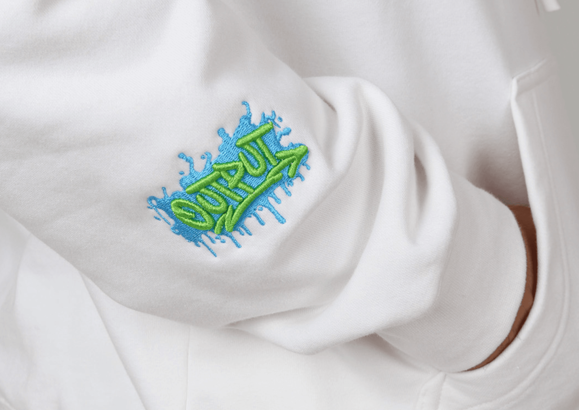
Updated October 2026
Which print on demand companies offer 3D puff embroidery?
PODpartner runs 3D puff embroidery on hoodies, sweatshirts, tees and caps — not just hats — in 1.5mm or 3.0mm foam, for a $0.98 per-frame add-on. All 15 thread colours are available with no colour surcharge, and puff can sit alongside flat embroidery, DTG and Heat Transfer Vinyl on the same garment. Printful offers 3D puff on hats only. On Printify it depends on the provider fulfilling the order, and Tapstitch doesn't offer embroidery. Whichever platform you use, the logo decides more than the machine: every stroke needs to be at least 5mm wide, and letters at least 10mm tall.
| 3D puff capability | PODpartner | Printful | Printify | Tapstitch |
|---|---|---|---|---|
| 3D puff on hoodies, sweatshirts, tees | Yes | No — hats only | Varies by provider | No embroidery |
| 3D puff on caps | Yes | Yes | Varies by provider | No embroidery |
| Foam thickness | 1.5mm or 3.0mm | — | — | — |
| Thread colours per design | All 15, no colour surcharge | 6 of 15 on standard embroidery | 6 of 15 | — |
| Puff surcharge | $0.98 per frame | — | — | — |
| Puff + DTG + Heat Transfer Vinyl on one garment | Yes — up to 4 techniques on apparel, 3 on caps | No | No | No |
Platform aside, most logos people send us for 3D puff don't work well in it. The artwork is usually fine. The problem is physical. Puff sits on a layer of foam under satin stitches, and that foam needs room. Thin lines, small text, and fine detail don't give it any. The good part is you can tell in about ten seconds whether your logo is a fit. Here's the test, and what to do if your design doesn't pass it.
The one number that decides it: 5mm
A satin column needs to be at least 5mm wide to cap the foam cleanly. That's roughly a fifth of an inch. Go narrower and the stitches can't hold the foam down on both sides. It gets pushed flat, or it peeks out through the thread as little specks along the edge. Some digitizers will run 3mm on a simple shape. We don't build a logo around that hope. If any stroke in your design is thinner than 5mm at the size it'll actually stitch, it won't hold puff.
Under 5mm strokes, or letters under about 10mm tall, and puff starts to look like a defect instead of a feature.
Lettering works the same way, measured as height. Letters under roughly 10mm tall lose the effect, because the columns get too thin and the edges break down. Bold caps at 15mm and up are where puff looks its best. That range is the technique's home turf.
Height is the reason foam thickness matters too. The stitches have to wrap around the foam and hold it, not crush it flat. On a thin stroke the thread presses straight through the foam and you lose the lift. Go a couple of millimeters taller on the foam and the same design stands up cleanly. That's the difference between our 1.5mm and 3.0mm puff, and why bigger, bolder marks take the 3.0mm well.
Logos that work in puff
The ones that puff cleanly are bold and simple, and big enough to give the foam room. Think fat block letters, a thick sans wordmark, a solid monogram, a clean badge or star. One or two colors. Placed somewhere with space, like a cap front, a left chest, or a back panel.
Look at the puff logos on retail streetwear caps next time you're in a shop. Almost all of them are a few chunky letters or one solid shape. The technique is quietly telling you what it does well.
Logos that don't (and why)
Here's what fights the foam:
- Thin script and handwriting fonts. The strokes taper well below 5mm.
- Small text. Taglines, URLs, and fine print sitting under a main mark.
- Tight gaps and fine detail. Puff can't hold a 1mm space between two elements. The foam just bridges it.
- Gradients and shading. Puff is a solid raised block, so blends and soft edges flatten out.
- Busy shapes with lots of holes or spikes. Those need a fill stitch, and fill presses the foam flat, which kills the whole point.
Run any of these in puff on their own and the logo ends up looking low-grade. That's the opposite of what most people are after when they ask for it.
Example
Someone in an embroidery forum ran a thin outline around the letters of a company logo in puff. The result came out bumpy. They pushed the density up to fix it. It didn't help. Two working embroiderers looked at the same job and gave the same read: the thin lines were the problem, and no density setting saves a stroke that's too narrow. One of them put it plainly, that puff is a pain in general and they wouldn't touch fine lines like that at all.
The lesson isn't "try harder." It's that some artwork won't hold puff at any setting, and the time to catch that is before you stitch a run.
Fonts that puff clean, and ones that don't
If your logo is type, the font decides most of the outcome. You want thick, even strokes that give the stitches room to wrap the foam. Bold block and athletic styles are the safe bet. College Block and Varsity for a team or collegiate look. Impact, Arial Black, and Anton for a clean modern mark. Bebas Neue when you need to fit a longer word across a cap front, since it's condensed but still has even weight. Most of these hold puff well from about 0.4 inches (10mm) tall and up, with 0.6 inches (15mm) or more giving the best result.
The fonts that fail are predictable. Thin scripts and handwriting styles like Brush Script taper below the point where puff works. High-contrast serifs like Times are worse, because the thick parts rise while the hairlines sink, so the letter comes out lumpy. Anything with tiny cutouts or flourishes loses that detail once the thread caps the foam. Caps add one more rule. The curved panel and tight space favor tall, upright letters, so vertical block fonts read better on a hat than wide ones.
What to do when your logo doesn't fit
You don't have to give up on puff. You split the job. Keep the fine text and thin lines flat. Lift only the part that should stand up, usually the main mark or icon. Both stitch in a single pass, on the same garment. This is how the clean streetwear pieces get made. The logo pops, and the tagline underneath stays sharp enough to read.
We run flat and puff together in one design as standard, so you don't have to choose. There's more on how that works on the 3D puff embroidery page.
You can stack techniques on one piece
Splitting flat and puff is one version of a bigger idea. We're a single factory that runs every decoration in house, so we can layer more than one on the same garment in a single order — what we call the Hybrid Process. That's how you get a piece that reads like retail instead of print-on-demand, and it's the part most POD platforms can't do.
Here's what stacks together:
- On apparel, up to four in one piece. Flat embroidery, DTG print, 3D puff, and Heat Transfer Vinyl, layered on the same hoodie or tee.
- On caps, up to three in one piece. Flat embroidery, 3D puff, and Heat Transfer Vinyl on the same hat.
- Puff over flat, always. Raise the mark, keep the fine text flat, in the same design.
- Any 15 colors, no color surcharge. Pick from the full 15-thread range at no extra cost. Puff carries a small per-frame add-on of $0.98. Most shops charge a $2 to $5 premium for puff, since it slows the machine and needs hand-trimming, so that's a low bar to clear.
- Apparel and caps, both. 3D puff isn't cap-only here. It runs across hoodies, sweatshirts, tees, and hats.
So if your logo doesn't suit pure puff, you've still got room to build. Puff the icon, DTG the full-color art, Heat Transfer Vinyl the lettering, flat-stitch the fine text, on one garment, in one pass.
Thick fleece and heavy hoodies change the math
Fabric matters as much as the logo. On a 380GSM brushed fleece or a heavy hoodie, the surface has a deep nap. A low 1.5mm puff can sink into it and lose most of its height.
There's a nuance here. A firm, heavy fabric is actually a good base for puff, and it holds the raised effect better than a thin, flimsy one. The trouble with brushed fleece is the pile, not the weight. A deep soft nap can swallow a low logo. So the fix is two parts. Go taller first. 3.0mm holds up far better than 1.5mm on thick fleece. Then back it properly. A cut-away stabilizer under the design gives the stitches a firm base, so the puff sits up instead of pressing down into the pile. Skip the backing and the logo drifts and goes flat after a few wears. If you're choosing a hoodie for puff, our heavyweight oversized hoodie guide covers the fabric side.
One more that catches people out. The foam color has to match the top thread. Run a gold logo over white foam and you'll get white flecks along the edges where the stitches don't fully cap it. We match foam to thread on every job, so that part's handled for you.
Watch your placement
Keep puff away from high-friction spots. Cuffs, inner collars, and anywhere a strap or bag rubs will crush or snag a raised logo over time. Chest, cap front, and back panels hold up fine.
Tell your customers one thing: heat is the enemy
Puff holds up fine to normal wear. What flattens it is heat and rough handling. A hot dryer will press the foam down over time, and ironing straight onto a raised logo will crush it. If you want a care line on your tag or product page, keep it simple. Wash cool, skip the dryer or run it low, and if you iron, do it inside out or around the logo. That's the whole list.
Run this check before you send artwork
- Every stroke at least 5mm wide at final size
- Letters at least 10mm tall, 15mm or more is better
- One or two colors, no gradients or soft shading
- Any fine text or tagline marked to run flat
- A vector file, or a DST if you already have one
Send it over and we'll flag anything that won't hold puff before you order. It's far less costly to fix a file on screen than to reprint a run of a hundred.
3D puff questions, answered
Which print on demand companies offer 3D puff embroidery?
PODpartner offers 3D puff on hoodies, sweatshirts, tees and caps, in 1.5mm or 3.0mm foam, for a $0.98 per-frame add-on, and can combine it with flat embroidery, DTG and Heat Transfer Vinyl on the same garment. Printful offers 3D puff on hats only. On Printify it depends on the fulfilling provider, and Tapstitch doesn't offer embroidery.
What is 3D puff embroidery?
It's embroidery with a foam layer under the satin stitches. The foam lifts the design off the fabric, so a logo stands up in relief instead of lying flat. The result is the bold, raised look you see on premium streetwear caps and hoodies. It works best on bold, simple shapes.
Which is better, 1.5mm or 3.0mm puff?
1.5mm gives a clean, modern lift that suits smaller or slightly finer logos. 3.0mm gives bold streetwear depth and wants a big, simple mark. On thick brushed fleece, go 3.0mm, because a low lift can sink into the nap. All 3D areas in the same frame share one thickness.
Does 3D puff cost more than flat?
A little. Puff adds $0.98 per frame here. For context, most shops charge a $2 to $5 premium for puff, because it slows the machine 25 to 40 percent and needs a hand-trimming pass. So $0.98 is a low bar, and it doesn't affect turnaround.
What fonts work for 3D puff?
Bold block and athletic fonts: College Block, Varsity, Impact, Arial Black, Anton, and condensed heavies like Bebas Neue for longer words. Keep letters at about 0.4 inches (10mm) tall and up, ideally 0.6 inches (15mm) or more. Avoid thin scripts and high-contrast serifs like Times, where the hairlines sink and the thick parts rise, so the letter comes out lumpy.
Can I mix flat and 3D puff in one design?
Yes, and it's the fix for puff's biggest weakness. Fine text and thin lines fail in puff, so keep those flat and lift only the bold mark. Both stitch in one design, one pass. Most platforms make you pick one finish per design. Here you don't.
Will 3D puff hold up in the wash?
Under normal wear it's fine. What flattens puff is heat and rough handling. A hot dryer presses the foam down over time, and ironing straight onto a raised logo crushes it. Tell your customers to wash cool, skip the dryer or run it low, and iron inside out or around the logo.
What products can take 3D puff?
Hoodies, sweatshirts, tees, and caps. Unlike platforms that limit puff to hats only, we run it across apparel and headwear, from our own heavyweight blanks. That means a cap and a matching hoodie can carry the same raised logo.
See what puff looks like at 1.5mm and 3.0mm on real garments, or send your logo and we'll tell you straight whether it'll work. PODpartner runs 3D puff embroidery on apparel and caps with no minimum, and can mix puff and flat in one design, so you can order a single piece and see how your logo sits before committing.
See the 3D puff page →Related reading
- 3D Puff Embroidery on Apparel and Caps · product page
- Puff Embroidery Hoodies: pricing, 1.5mm vs 3.0mm · guide
- Custom Hat & Cap Embroidery · guide
- Custom Embroidery: A Guide for Brands · guide
- Printful alternatives: where 3D puff on garments fits · comparison
- Combining DTG, embroidery and Heat Transfer Vinyl · guide